Pen Show Calendar
Updated as of August 29, 2024!
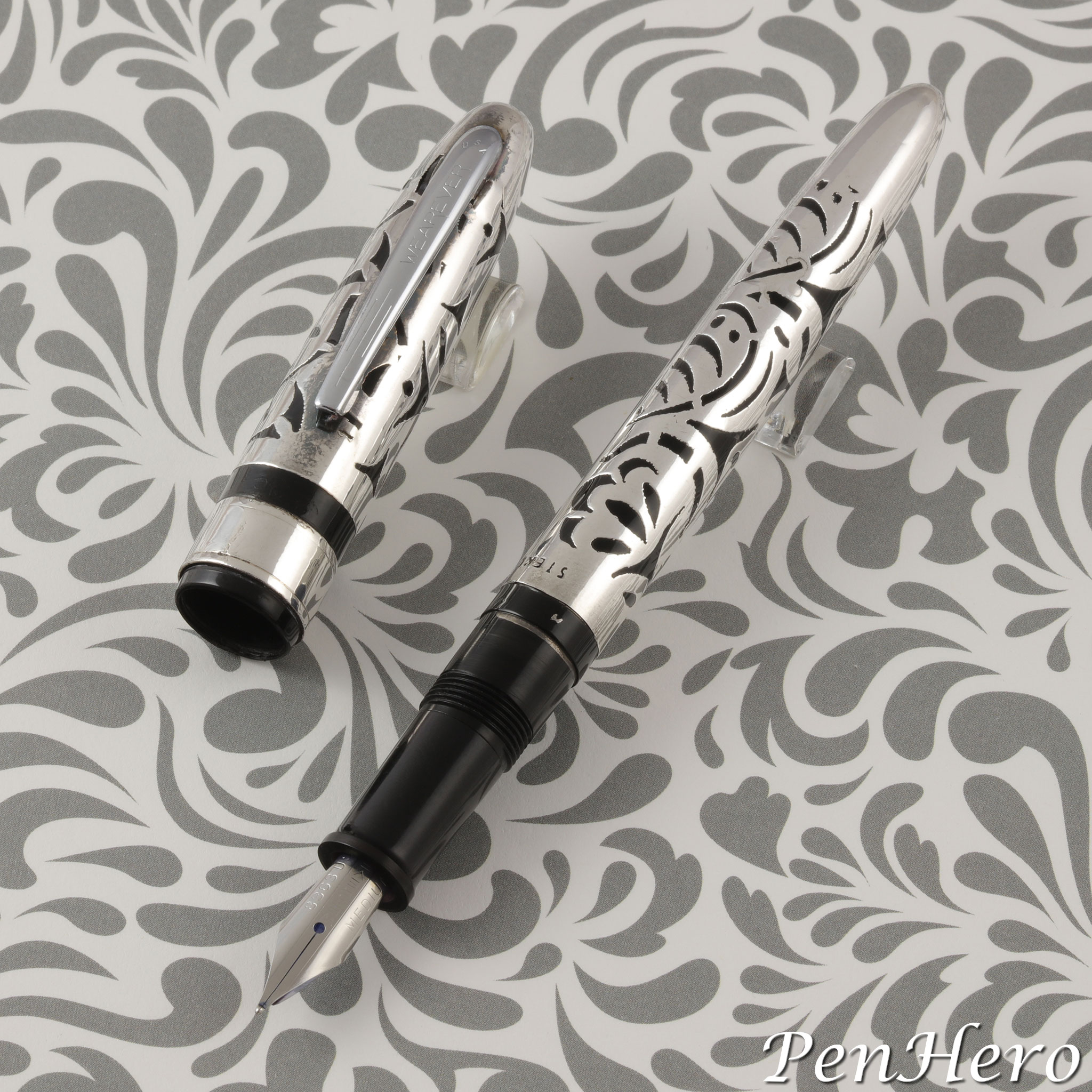
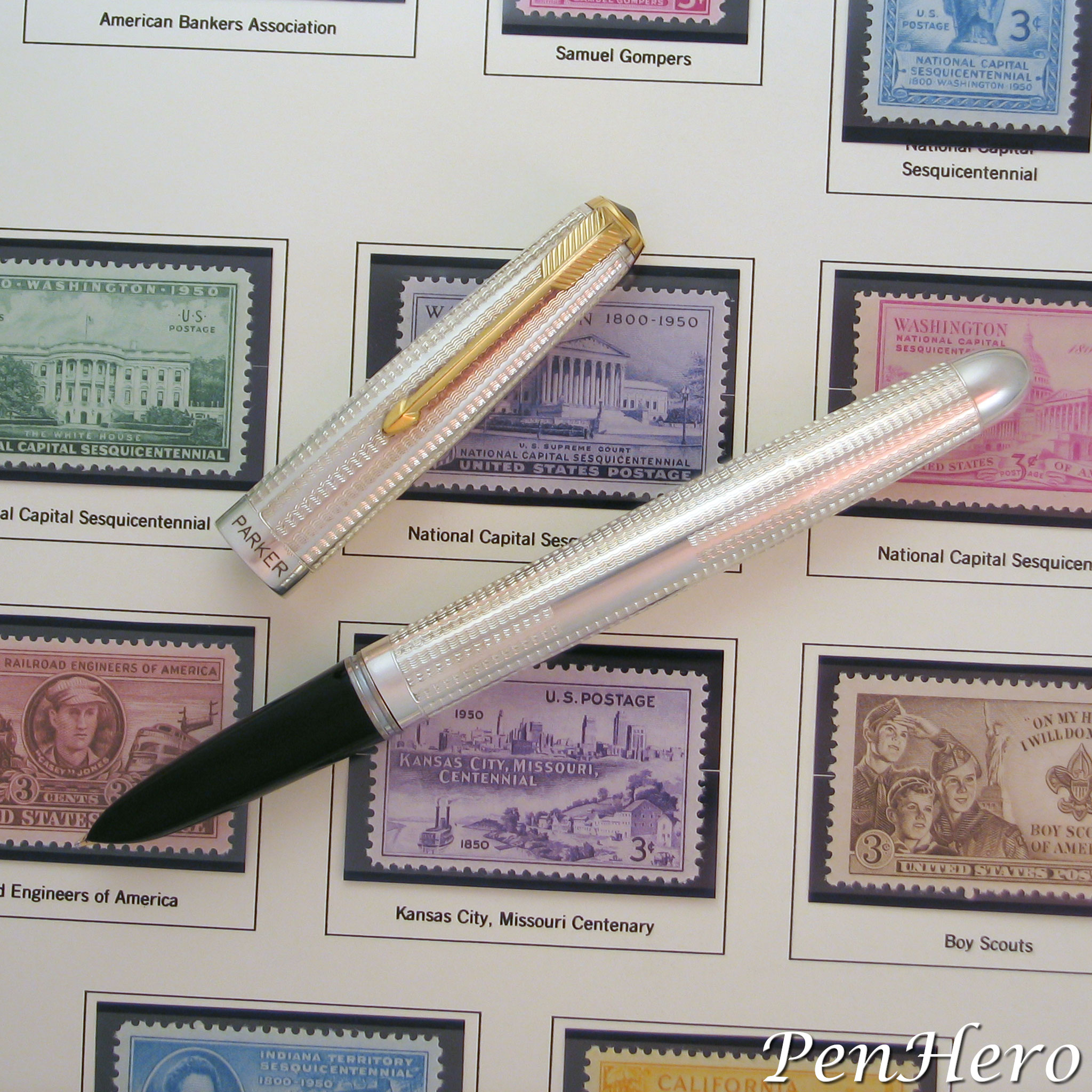
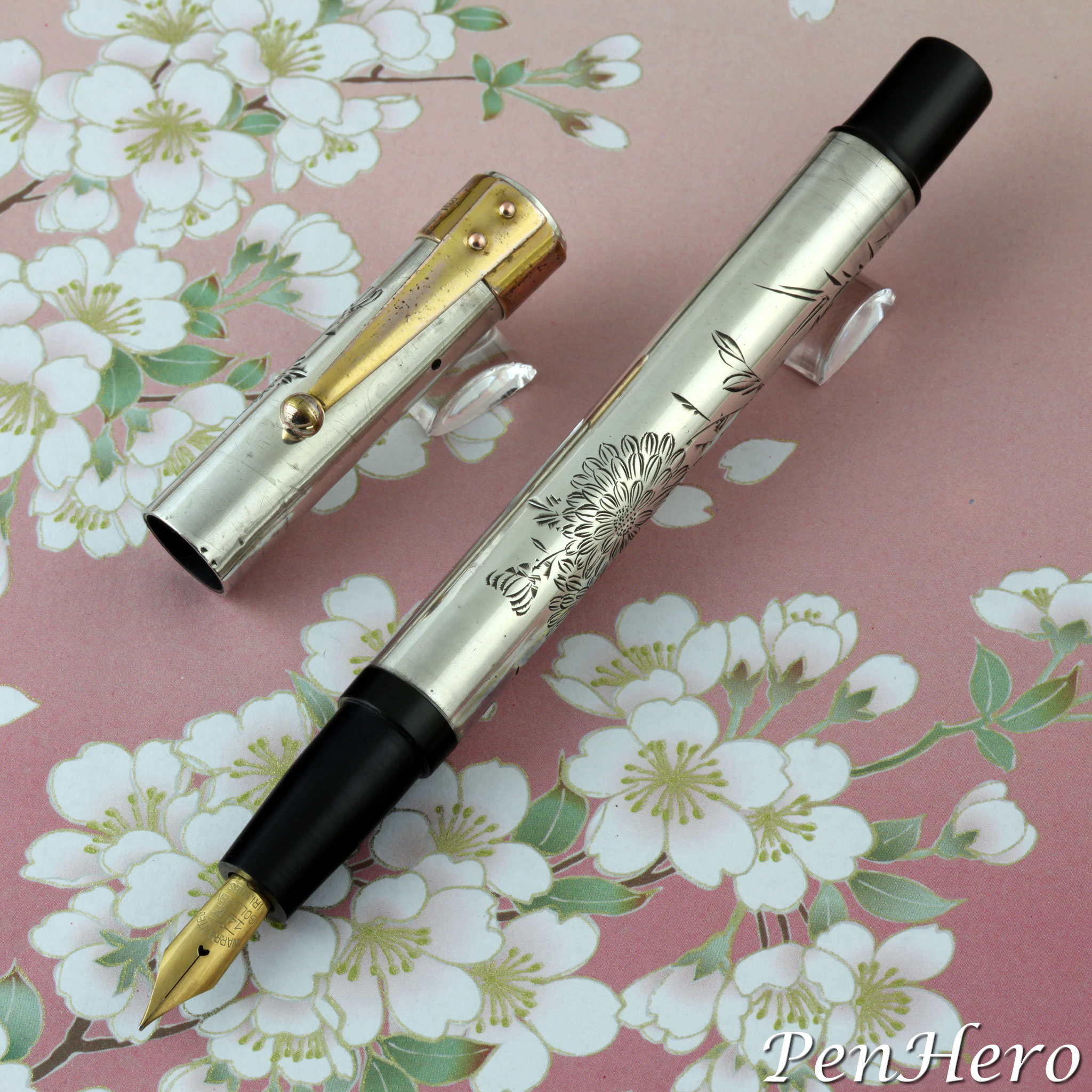
Wearever Sterling Silver Overlay Cartridge Fountain Pen 1969
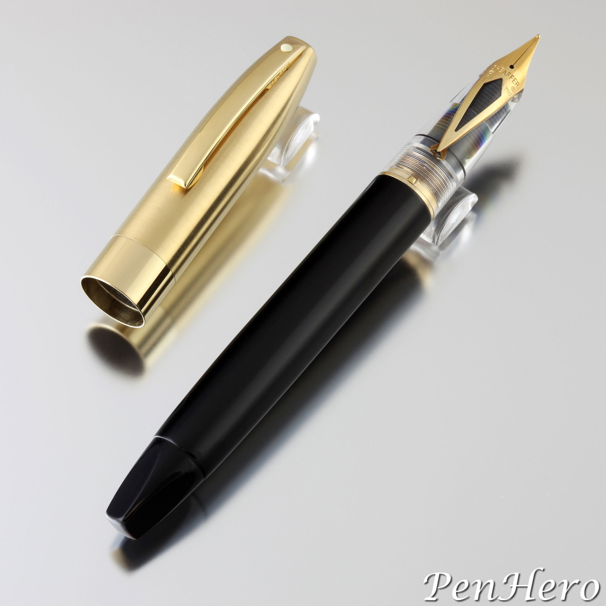
This is a pen that is often described as the “Wearever Grail Pen” and like many uncommon pens has a bit of folklore attached to it. There are Wearever collectors who have or hope to have one. Hopefully I can clear up some of the story, but there are things that are just lost to history. I’ll present the facts that I could find and try to fill in the rest with intelligent guesses. Based on the packaging, this was a specialty version of one of David Kahn, Inc.’s Wearever cartridge fountain pens from the 1960s. It resembles a black plastic cartridge version of the Wearever Supreme with a sterling silver overlay. These were probably only made for the 90th Anniversary Woolworth’s Stockholder’s Meeting, making them a special order item that may not have been made before or since. It was probably only made in black and probably had no matching pencil.Read the story about these interesting pens here!
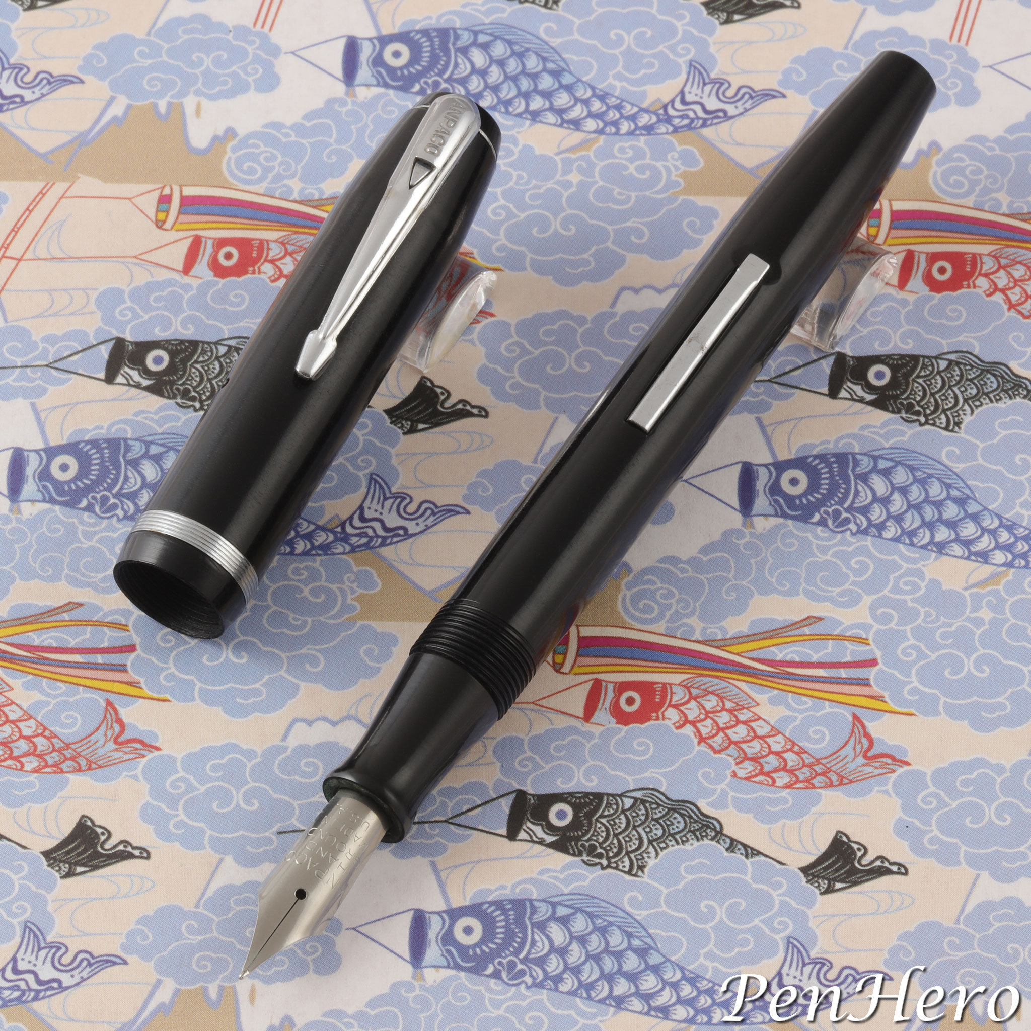
A. N. Palmer Anpaco Fountain Pen c. 1945-1949
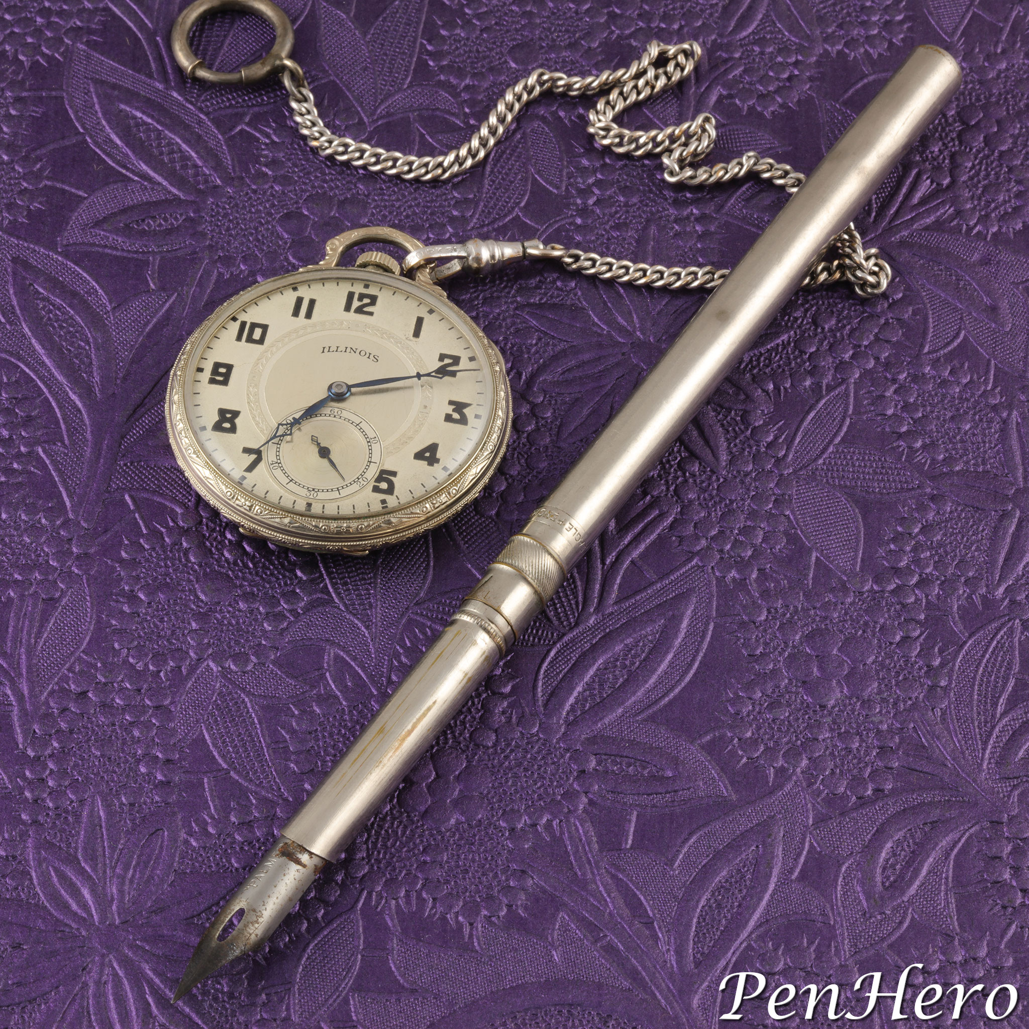
Another week and another pen mystery solved! This is a specialty OEM version of a late 1940s Eagle fountain pen for the A. N. Palmer company for use with the Palmer Method. It was probably only made in black and likely had no matching pencil. The emphasis on "hand ground" stamped on the nib indicates that it was likely a special nib grind which would account for the higher price over an ordinary Eagle fountain pen with a stainless steel nib.Read the story about these interesting pens here!
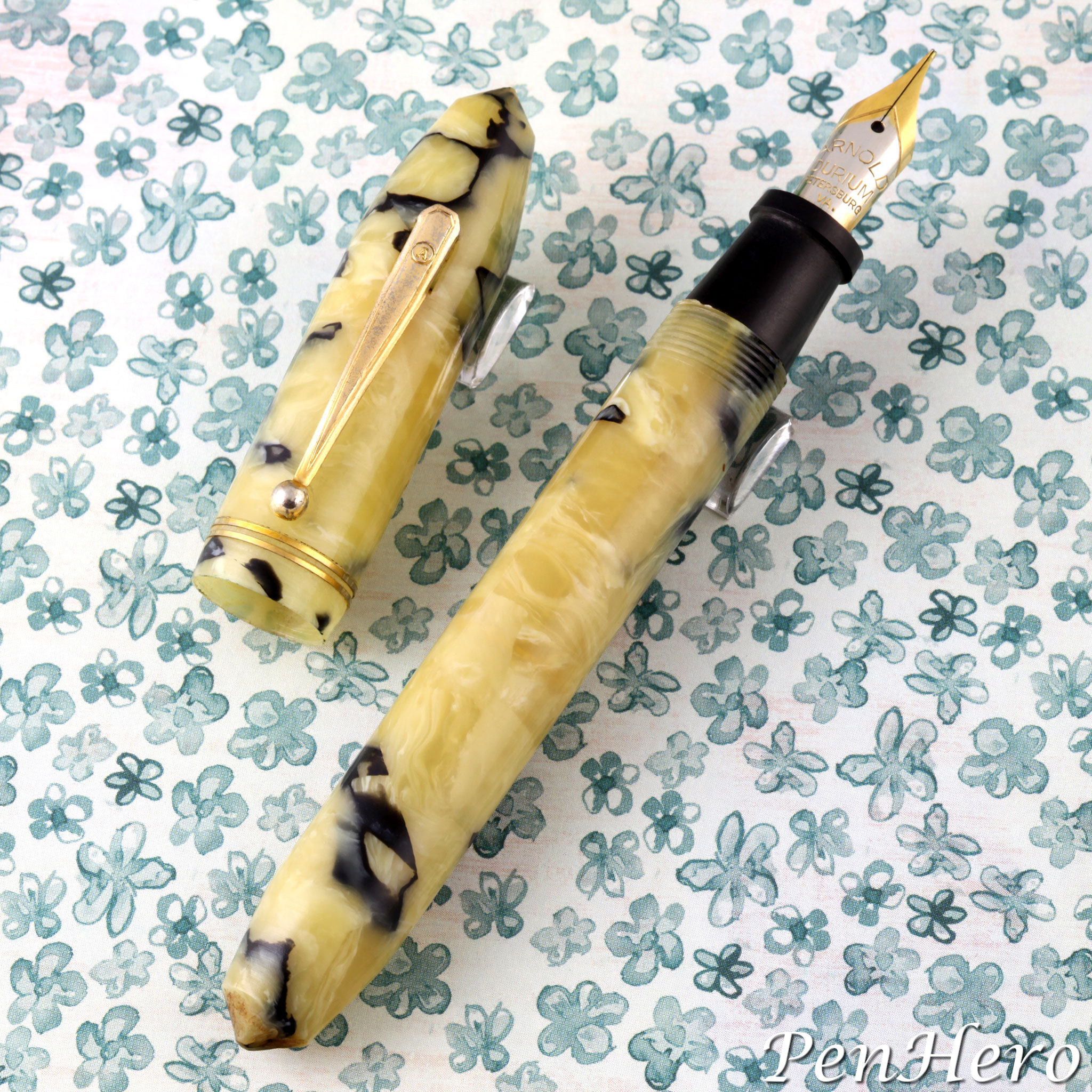
Early Arnold Fountain Pens c. 1935-1939
Was Remmie Arnold the King of the Cheapies? Did the Arnold Pen Company make anything worth collecting? The answers may surprise you! If Remmie Arnold, founder and owner of the R. L. Arnold Pen Manufacturing Company, was to tell his own life story, it would sound a lot like his profile given in Virginia newspapers when he was running for the Democratic nomination for the 1949 Virginia governor’s race. Each telling was like a “Horatio Alger rags to riches story,” as if written by a New York agency. From a lowly beginning, Arnold started his career as a clerk at the Edison Pen Company in Petersburg, Virginia. After twenty years learning the pen manufacturing business, he rose to be the company’s general manager and president. He left Edison in 1935 at the age of 41 and founded his own namesake pen company and launched a career of making and selling low price, low cost pens by the thousands to major retail chains and advertising companies. By 1942, the Arnold Pen Company was the second largest manufacturer of pens and pencils in the world, by volume. But are there any collectible Arnolds?Read the story about Remmie Arnold and his early pens here!
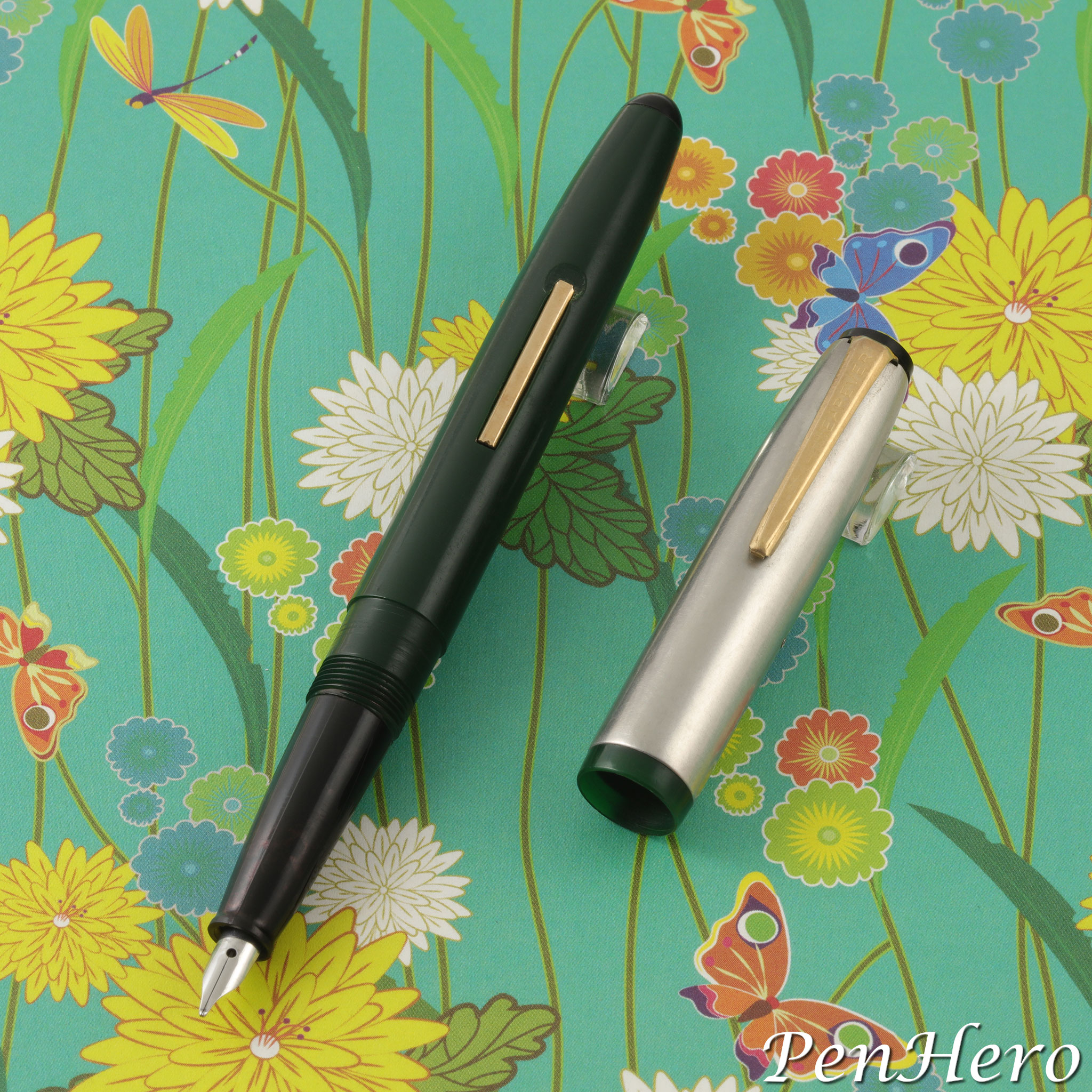
Wearever De Luxe 1947-1949
This third version of the Wearever De Luxe will cause a double take as it looks so much like the Pennant. It's a lever-fill pen with an injection molded plastic barrel and inner cap. The cap has a satin finish stainless steel sleeve, giving it the appearance of having a metal cap. The cap top and section are black plastic. The section is tapered similar to a late 1940s Waterman Taperite fountain pen and has a small unmarked stainless steel nib. The clip and lever are gold plated. It’s not known how many colors or nib sizes were made, but it’s likely they are the similar colors as the earliest Pennant, in darker shades of maroon, green, navy, and gun metal. The plastic used to make the Pennant was described in David Kahn, Inc. advertisements as Forticel, made by the Celanese Plastic Corporation.Read the story about this interesting pen here!
Wearever Pacemaker 1955-1959
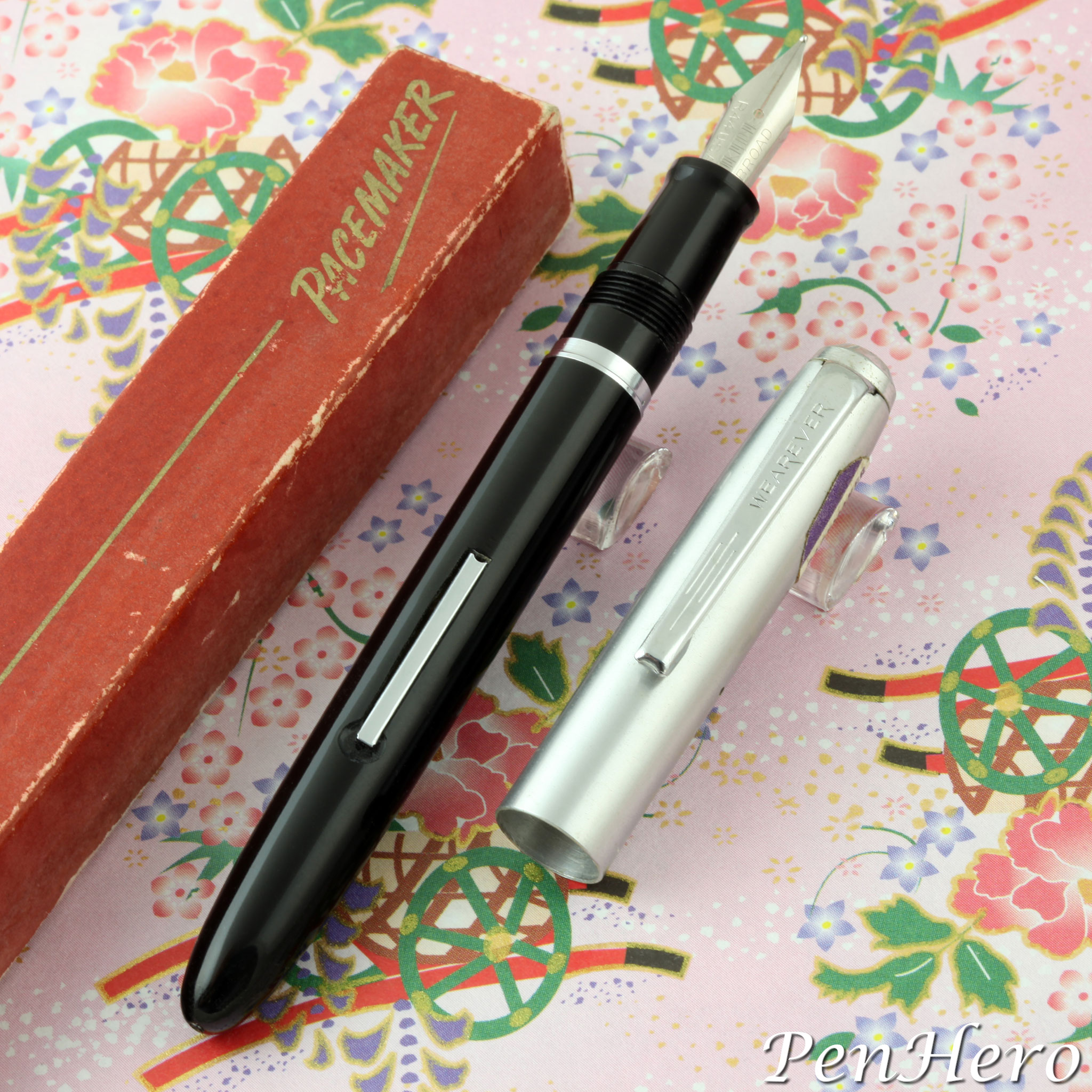
The 1955-1959 Wearever Pacemaker has a similar look to the Pennant but is a bit more “refined.” The barrels came in five colors, Blue, Maroon, Green, Grey, and Black, and some examples have matching color sections. It has an all metal, satin finish, silver color cap and a silver color metal cap top, clip, lever and trim piece on the section. These may all be made of stainless steel, but it’s not stated as such in any advertisements. I personally think they are. There are six exchangeable “Replace-A-Point” threaded nib units. This feature was similar to Esterbrook’s system, but the nibs are not interchangeable. The pen alone sold for $1.95 and for $3.25 with a matching twist action pencil.Read the story about this interesting pen here!
Parker 61 Jet Flighter 1959-1962
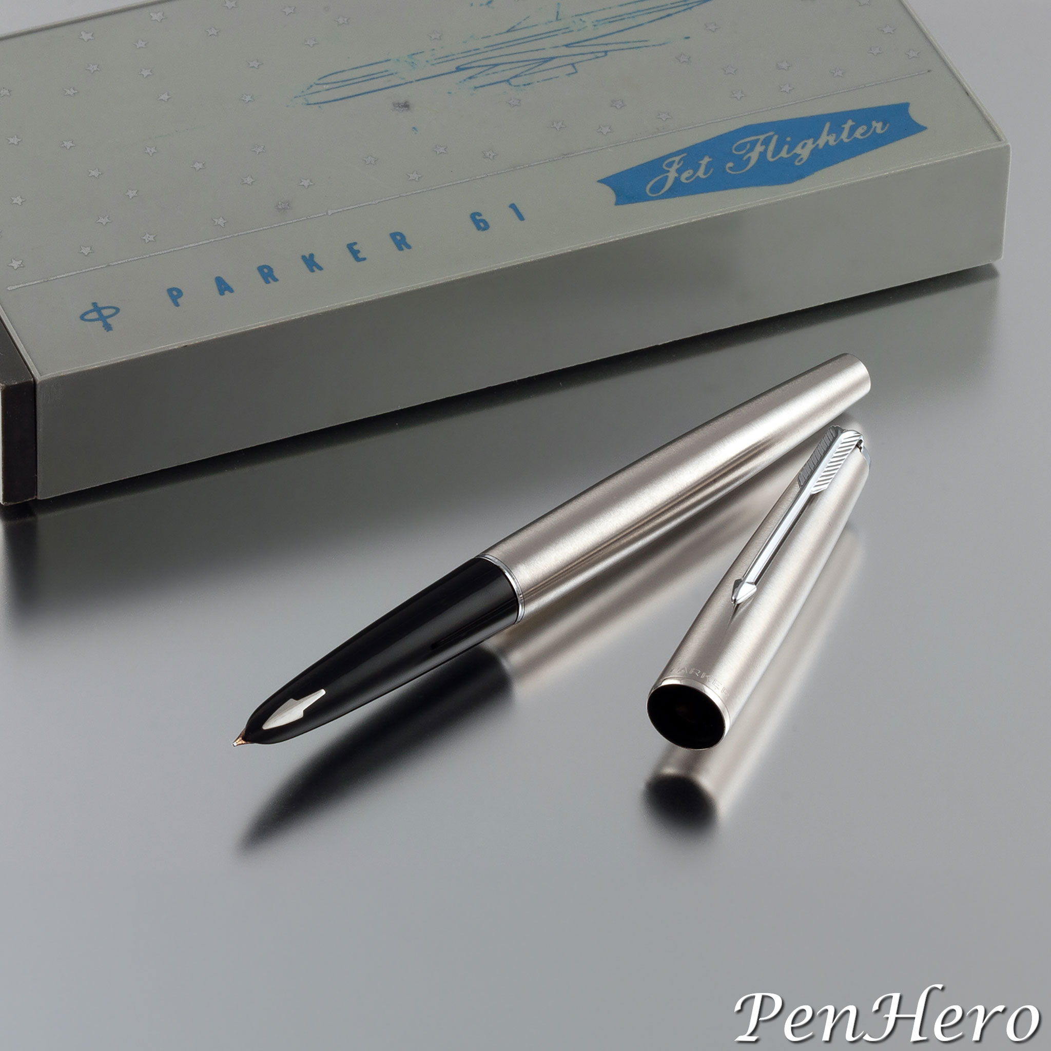
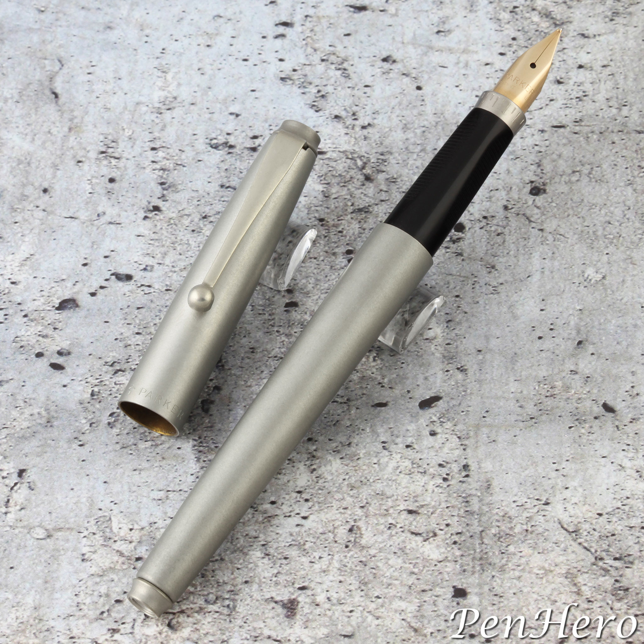
Inspired by the jet age, Parker introduced the 61 Jet Flighter model in 1959 with its cap and barrel made of "Lustraloy" brushed stainless steel, chrome plated trim, and fitted with a 14 karat gold hooded nib unit. It was packaged in a special box with graphics of the Jet Flighter name with a Douglas DC-8 silhouette. The 61 Jet Flighter is more angular, more tapered, and narrower than its 51 Flighter predecessor. Both the cap top and barrel end of the 61 Jet Flighter are fitted with gray plastic "jewels." The DC-8 was part of the new wave of American made jetliners and the association would tie the pen to high tech. Parker formally announced the new pen to retailers in the September 1959 Parkergrams U.S.A.Read the story about this interesting jet age pen here!
Victor Victapen Standard Size c. late 1930s
Up to now, many might think the c. 1932–1949 convertible compact Victapen purely as a small pen, sold with a matching pencil, where the two could be reconfigured into a 5 to 5 ½ inch long pen and pencil combo by removing the caps from the barrels of both the fountain pen and the pencil, putting the pencil point onto the end of the pen barrel, and replacing the pen cap back on. This example appears to be identical to the smaller Victapen except for size. Are there any more out there?Read the story about this beautiful pen here!
Sheaffer Triumph Masterpiece II c. 1945-1947
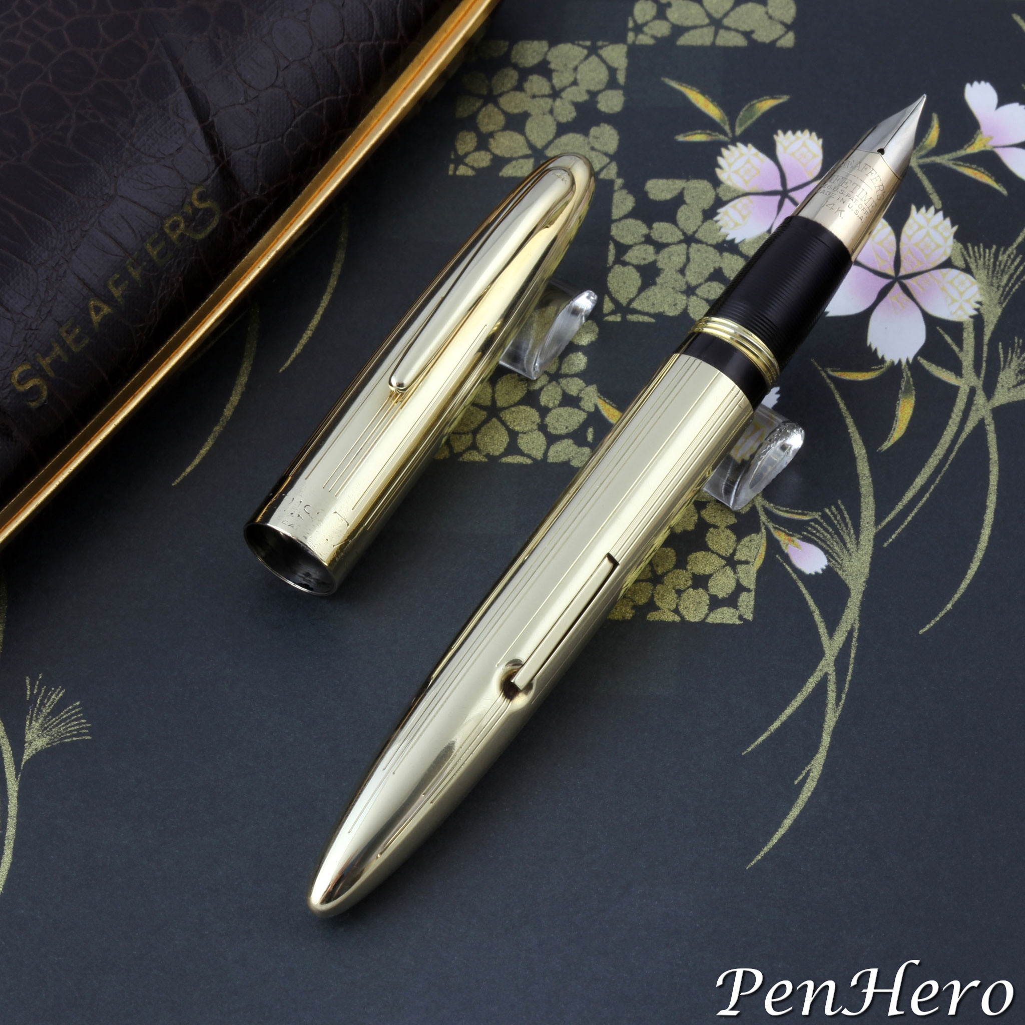
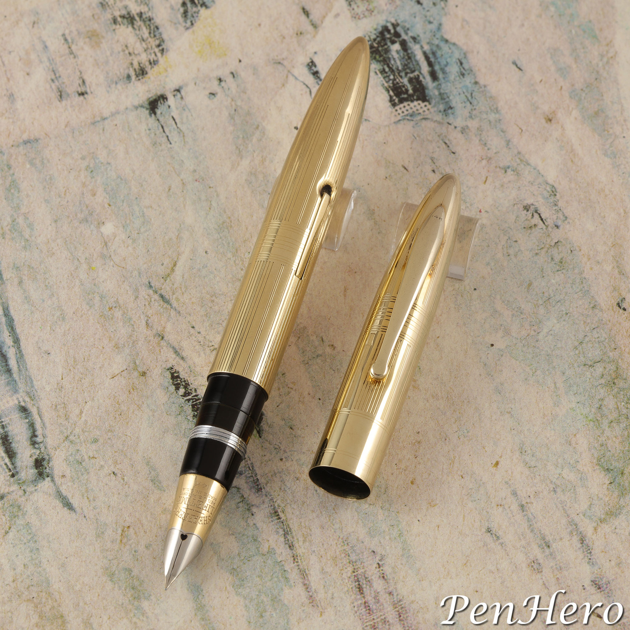
Sheaffer revised the Triumph pen and pencil line in 1945, making it more rounded, changing to a new clip design, changing the section, and adding a spring loaded mechanism to the clip. The update included a redesigned Triumph Masterpiece II pen and pencil shown in the 1946 catalog and the Masterpiece Stratowriter ballpoint pen was added in the 1947 catalog. The Triumph Masterpiece II continued in this form until Sheaffer began to install the White Dot in the cap and/or the Touchdown line was introduced. The Sheaffer Triumph Masterpiece II is a little shorter and less ornate than its predecessor. The cap is more rounded, complemented by a more rounded, spring loaded clip.Read the story about this beautiful pen here!
Sheaffer Triumph Masterpiece c. 1942-1944
What does the word "masterpiece" bring to mind? A dictionary definition would be, "a work of outstanding artistry, skill, or workmanship," and "an artist's or craftsman's best piece of work." A pen with that name would be expected to meet the very highest standards. It would have to represent the very best work of the pen company that offers it. There is very limited original documentation specific to the Sheaffer Triumph Masterpiece pen and pencil. Most of the reference material points to the time before and after the pen was offered, with a couple of direct Sheaffer documents confirming the pen existed in the Triumph line from at least 1942 and dealer advertisements offering the pen and pencil set through 1945.Read the story about this beautiful pen set here!
Aikin Lambert Combination Retracting Pen Holder and Pencil c. 1880-90s
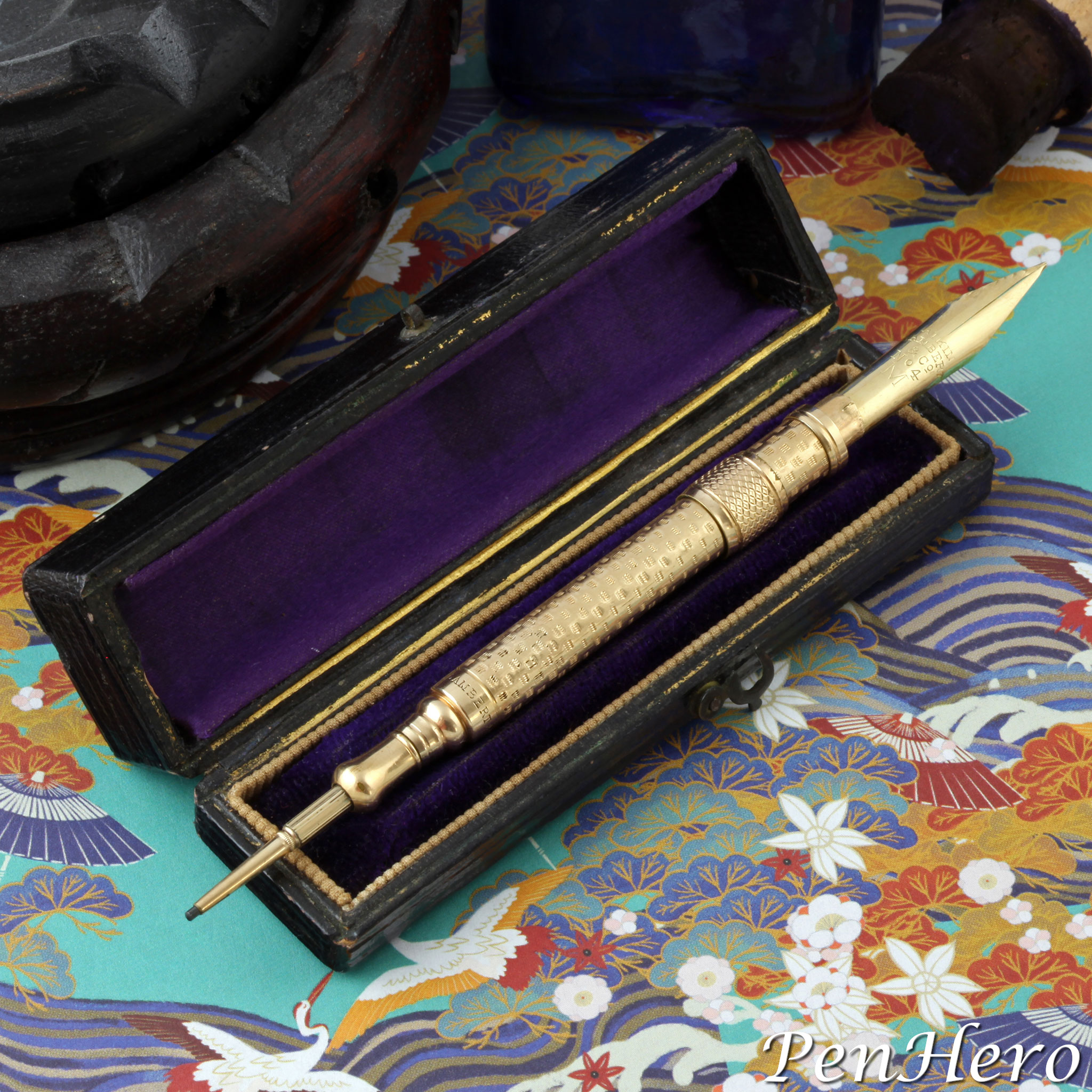
A very interesting find made in a New Bern, North Carolina antique store several years ago. This is an Aikin Lambert combination retracting dip pen holder and retracting twist mechanical pencil c. 1880-90s, complete with the original box. Fully open, as shown, the instrument is 4 7/8 inches long. Closed, it's a tiny 2 11/16 inches long. The nib extends by pushing the knurled band on the barrel from the pencil end toward the open end where the nib is hidden. The nib slips onto a tab that holds it in place and is kept inside the barrel when not in use. The very flexible gold nib is stamped AIKIN over LAMBERT over & CO over No 4 over M, a medium flexible nib. The mechanical pencil extends by pulling it out from the barrel and the lead advances and retracts by twisting the knob near the tip where the lead comes out. A beautiful and complex tiny writing instrument that is as much jewelry as it is functional.Read the story about this interesting writing instrument here!
Lambrou Pens Mirage Prototype c. 2017
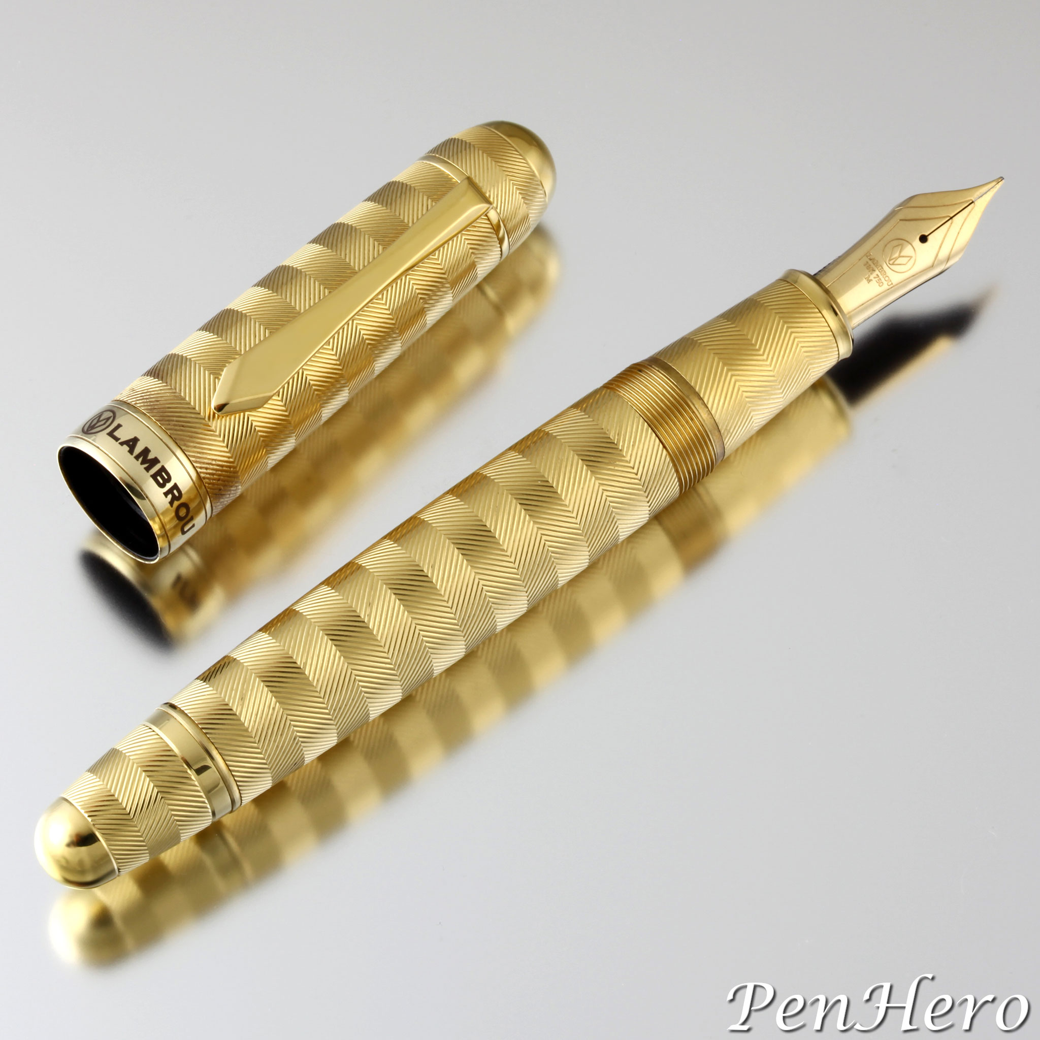
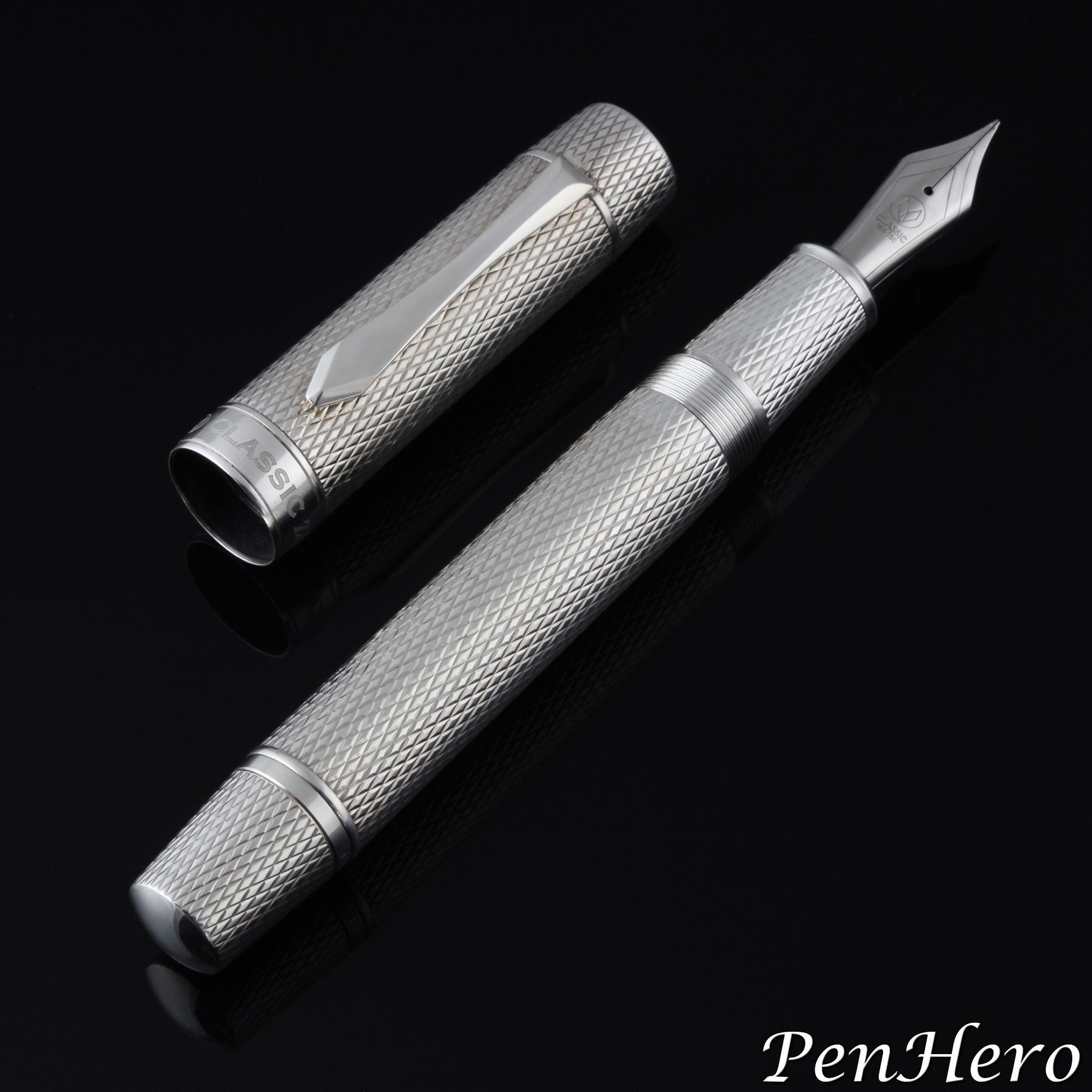
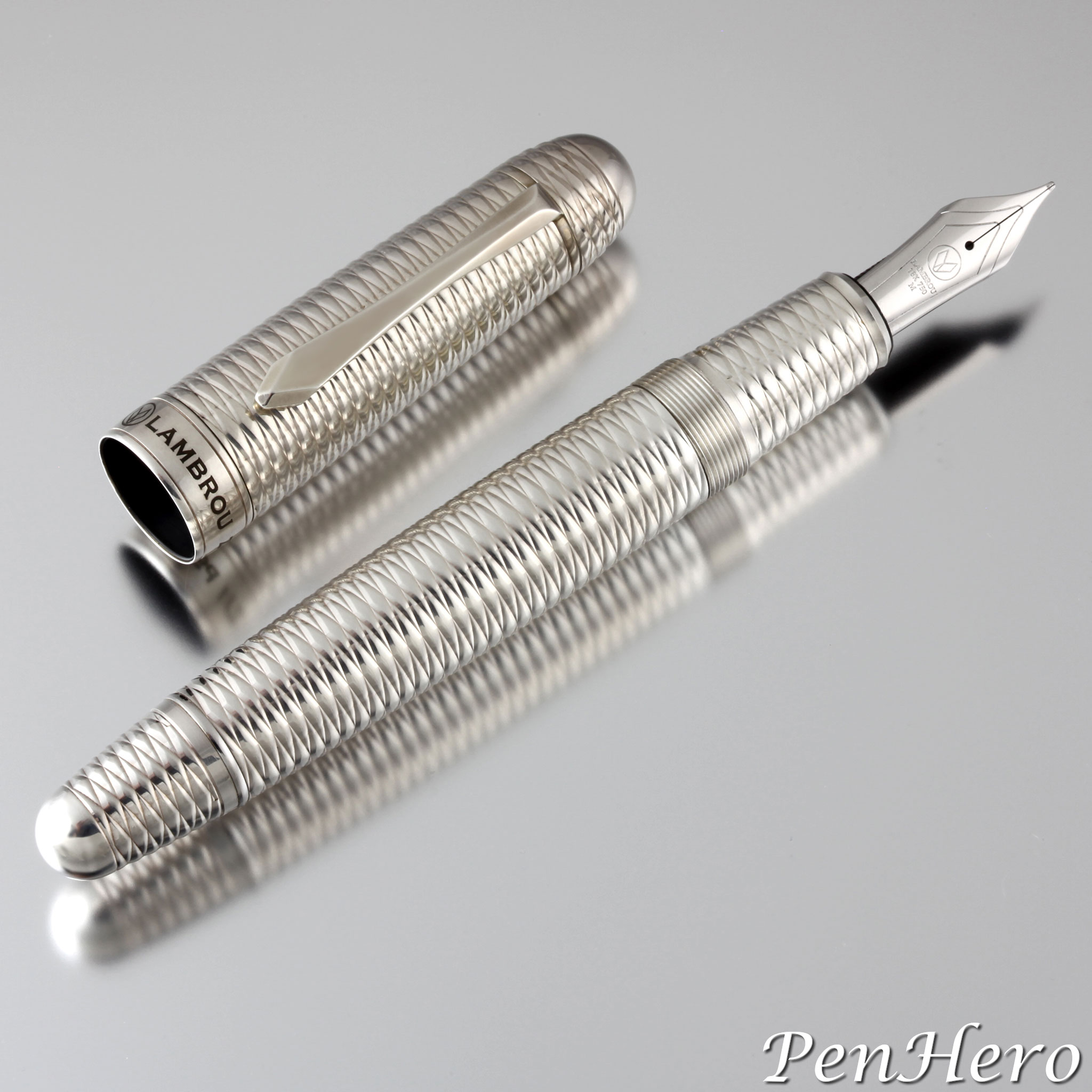
This is the Lambrou Pens Mirage prototype fountain pen made c. 2017. The mirage name comes from the alternating stacked engraved bands, each a deeply cut reeded edge, sometimes called “coin edge” that are cut at opposite 45 degree angles that create a strong contrast and emphasize each band. The geometric pattern does not have a formal name. Andreas Lambrou credited his assistant, Monica C Jimenez, for picking out this pattern for the prototype. The engraving was done on a modern computerized machine using brass blanks for each of the cap and barrel parts by the R. Murelli Company, an independent, specialty guillocheur workshop located in Domont, France.Read the story about this interesting pen here!
Lambrou Pens ZJ2 Gaia Prototype 2012
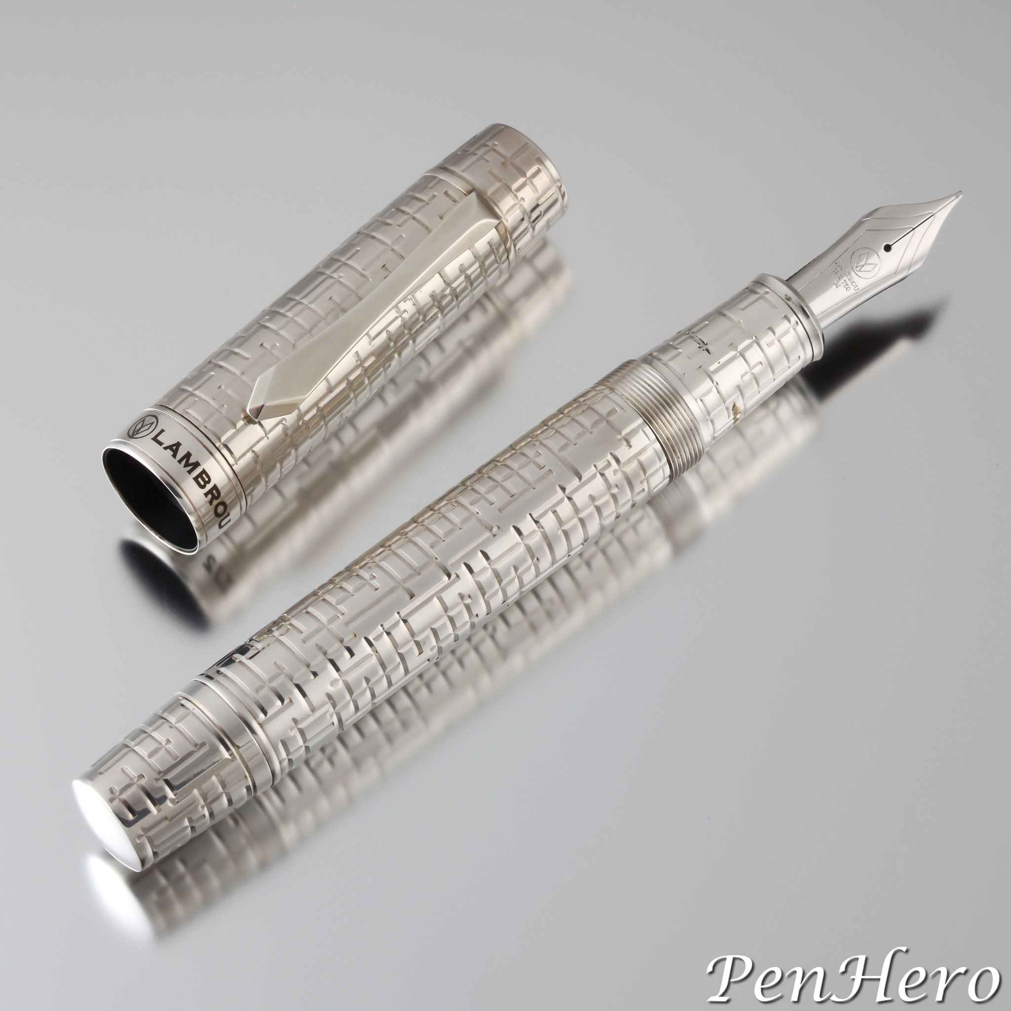
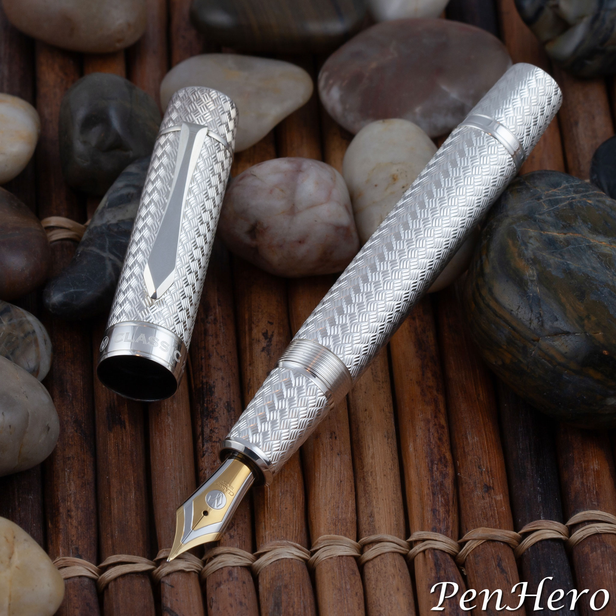
This is the Lambrou Pens ZJ2 Gaia prototype fountain pen made in 2012. Gaia or Gaea, in Greek, Γαία, is the ancient Greek personification of the goddess the Earth. Gaia was the mother of the Titans, the Gigantes, the Erinyes or Furies, and the Cyclopes. The guilloche engraving uses deep vertical and horizontal cuts crossing and meeting at right angles to represent the terrain where the decisive Battle of Thermopylae, between the small army of Spartan Hoplites and other Greeks against the huge Persian army invading Greece. The battle took place in 480 BC. The geometric pattern is otherwise unnamed. There is no direct connection between Gaia and Thermopylae, so the chosen names may simply be to tie the pen and design to elements of Greek mythology.Read the story about this interesting pen here!
Classic Pens ZJ2 Iliad Diamond Spirale Prototype c. 2009
The ZJ2 Iliad prototype is a 5 3/4 inch long cartridge/converter fountain pen based on the large size Lambrou Pens Mythos model 878. The diamond spirale design is intended to represent the strength, justice, and courage virtues of Achilles, the great Greek hero of the Trojan War and Homer’s Iliad. This ZJ2 Iliad silver plated prototype fountain pen gets the Iliad name because it is engraved with the same diamond spirale pattern as on the 1995 Classic Pens CP3 Iliad. This is the second in a series on ZJ2 prototype pens.Read the story about this interesting pen here!
Classic Pens ZJ2 Parisienne Vannerie Prototype 2009
This prototype is the Classic Pens ZJ2 Parisienne Vannerie, the follow-up to the ZJ1 Mozaique. Like the ZJ1 Mozaique, the design was intended to be engraved the entire length of the pen to the edges, taking advantage of the cylindrical shape with its flatter ends. This is very eye catching, as the design literally flows from end to end, as if running underneath the cap band, the clip washer and the barrel trim ring. The oversize cylindrical shape in this prototype also gives the cap top and barrel end cap a slight taper. It was also intended to fit an even larger nib size.Read the story about this interesting pen here!
Popura Ink Shut Off Eyedropper Pen In Chôshitsu Style c. 1930-1937
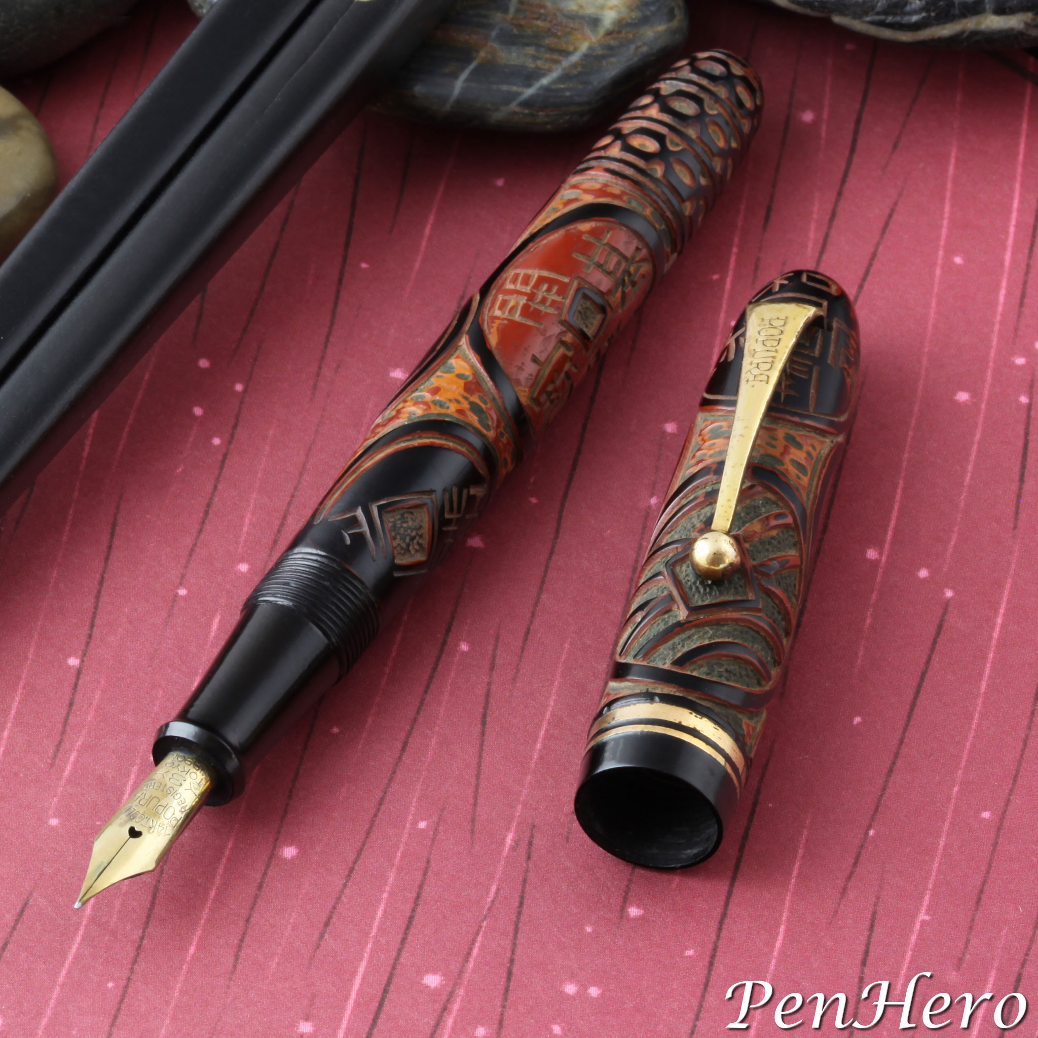
Popura is a less known, possibly obscure Japanese pen company that put a lot of effort into labeling their products with the brand name on clips, nibs and barrels. Since this article about this single Popura pen was published in 2017, more information has come available that fills in some of the missing parts of the story about the brand. This Popura ink shut off eyedropper fountain pen dates from about 1930 to 1937 because of the balance design and that it has a 14 karat gold nib without JIS markings. Unlike many pens from early small Japanese manufacturers that used rather generic hardware and trim pieces, this pen has branded metal parts. The gold plated clip is stamped with the brand name POPURA in a distinctive font. The nib is also stamped with the Popura brand along with full details: 14KT. GOLD over POPURA over REGISTERED over 3 over TOKYO over NIPPON. It’s not known if the company made their own nibs or, more likely, bought them with custom stamping.Read the story about this interesting pen here!
Pilot Short S-150SS Fountain Pen With Telescoping Section c. 1966-1969
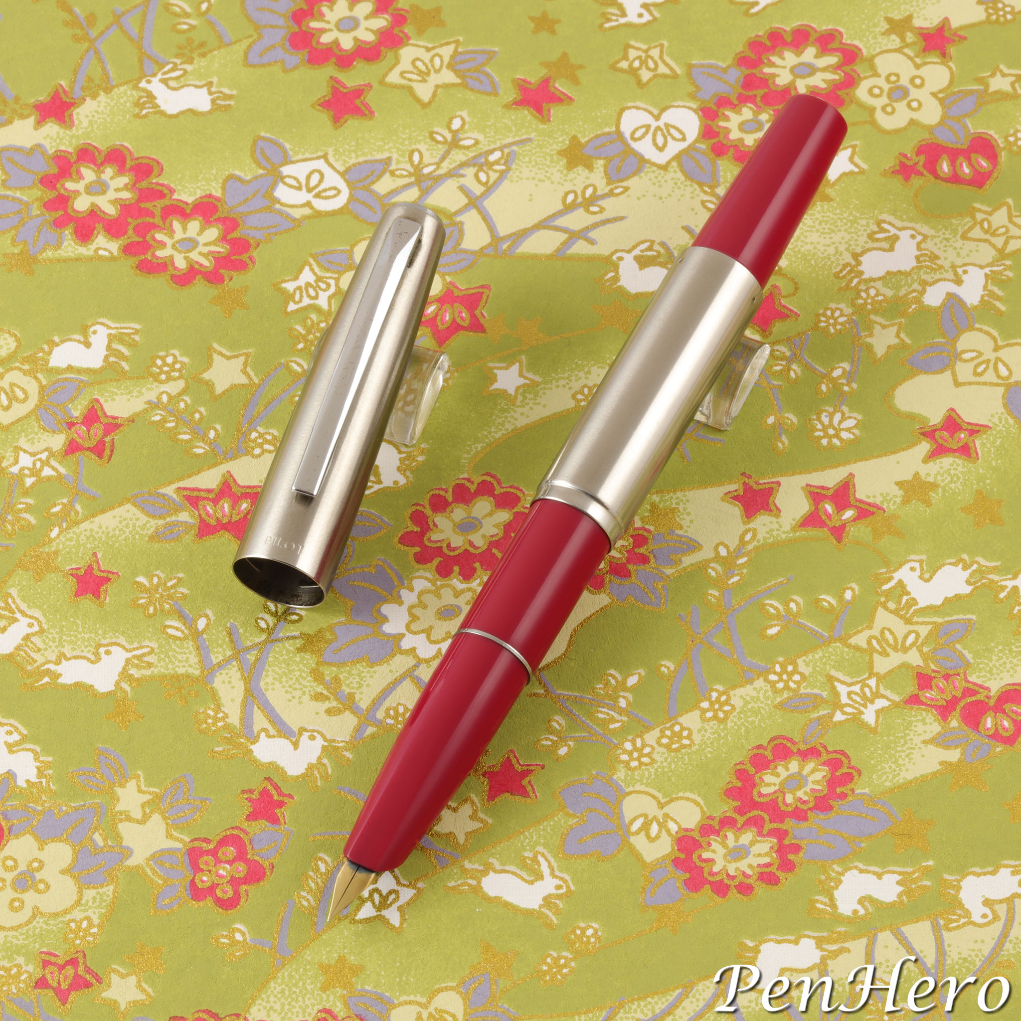
The Pilot Short is among the many 1960s to 1980s Japanese pens that are short and compact when capped and become long enough for comfortable writing when the cap is posted on the end of the barrel. To make this work, the cap and section are both quite long for the size of the pen. The Pilot Short has an added feature: the section can be extended by pulling on it, which increases the posted length from 5 1/16 to 5 5/8 inches, making it a very compact pen closed and still a comfortable pen to write with. Because of this quirky feature, the Pilot Short pens are often called “short telescoping” or “long-short.” The cap proportion to the barrel is less dramatic than on the Pilot Elite S and other similar pens, making the Pilot Short the one with the shorter cap.Read the story about these interesting pens here!
Lambrou Pens LN2 Harvest Prototype 2020
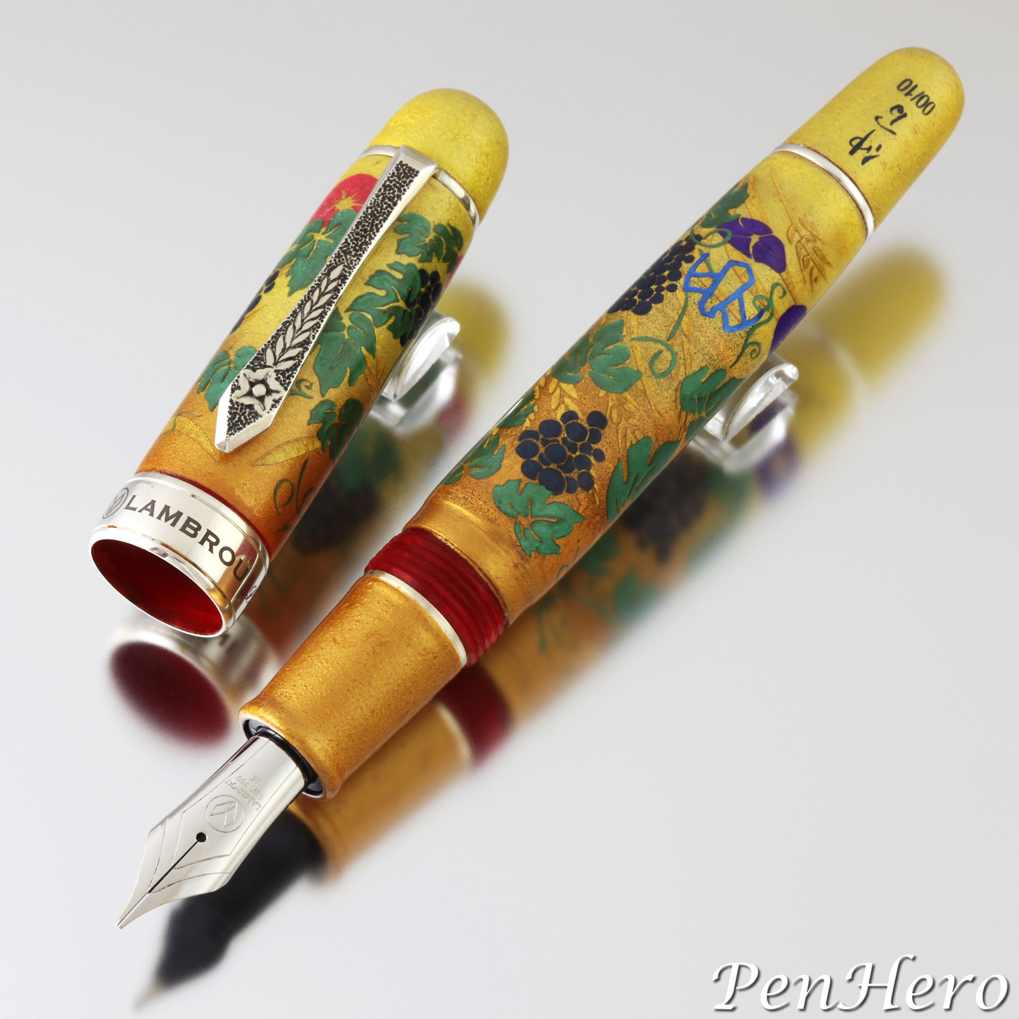
The Lambrou Pens LN2 Harvest artist proof shown here was made in July 2020. It’s a 6 inch long Lambrou Pens Oversize Legend hand crafted by Paul Rossi from Flame Red diffusion bonded acrylic with a Rossi made sterling silver floral design clip. The artwork is by Yoshitsugu Nakama, and because Nakama is allergic to urushi sap the decoration is made with an inert material he seals with epoxy resin. The Harvest design is based on the an original watercolor by Jenny Lambrou that was used for the other Classic Pens / Lambrou Pens Harvest models and represents harvest time on the island of Cyprus. Nakama’s interpretation is painted the cap and barrel with grapevine leaves, bunches of grapes, wheat stalks, and morning glory flowers over a pale yellow-brown coating to highlight the wheat artwork.Read the story about this interesting pen here!
Lambrou Pens Rossi Harvest Prototype 2009
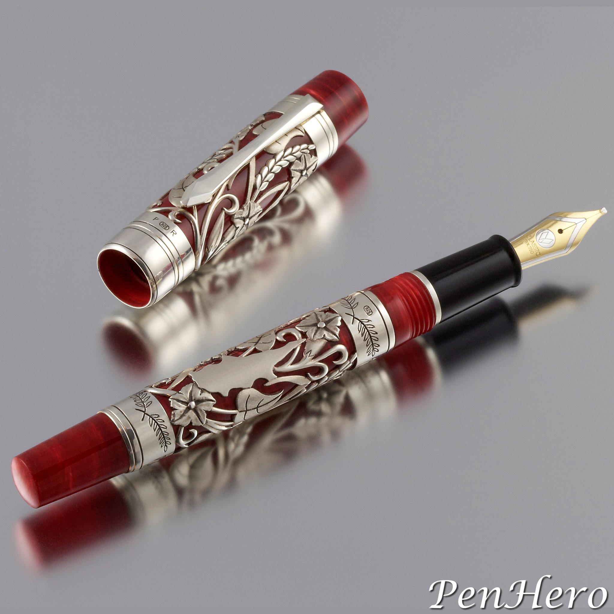
In 2009, Paul Rossi was asked to create a sterling silver overlay pen with a similar design as the 2001 Classic Pens LR2 Harvest with a few notable changes. This design is executed on 1.5 mm thick sterling silver tubes that allowed Rossi to carve the high relief design and with the textures and details that enhance the individual components of the work. The final design is a composition of intertwined morning glory flowers and wheat stalks on the cap and barrel overlays with a silhouette of the island of Cyprus surrounded with the design on the barrel sleeve. The island image pulls the design into the local scenery that inspired it. Other new design elements include olive branches engraved on the bands above and below the barrel sleeve and extending the cap sleeve to the edge of the cap lip, creating a sense that the overlay extends continuously from the cap to the barrel when the pen is closed. The clip is hand crafted by Rossi in sterling silver. Paul Rossi placed his hallmark on the cap band and top barrel band.Read the story about this interesting pen here!
Lambrou Pens Psaróvarka Prototype 2010
This prototype is the Lambrou Pens Psaróvarka or ψαρόβαρκα in Greek. It was made in 2010 using a brass Legend 778L as the base for the guillochage work. Psaróvarka or ψαρόβαρκα is a Greek word used for small fishing boats, and the deep engraving, with its broad braided look, evokes the heavy corded nets and ropes used on them. Like the CP8, it’s a 6 inch long cartridge/converter fountain pen. The R. Murelli Company used a modern circular engraver to complete the guillochage work. The finished pen was then coated with 5 microns of silver plate to provide an example of how it would look in sterling silver. Like the CP8, the engraving extends past the clip and also to the round end of the barrel. The clip is a hand crafted sterling silver piece by Paul Rossi. The nib is a G-380, 18-karat gold nib unit with ebonite feed by Peter Bock and is rhodium plated to compliment the sterling silver clip and trim.Read the story about this interesting pen here!
Vogue Streamlined Fountain Pens c. 1941-1948
What is the attraction of Eclipse Streamline pens and their kin, the streamlined Eclipse Vis-O-Ray and the Eclipse Hooded Knight? Maybe it’s the cool names. Names from another era. Imagine Buck Rogers flying in his Streamline cruiser spaceship shooting his Vis-O-Ray at Ming the Merciless with his sidekick the Hooded Knight! It could be the funky, halfway over the cap top clips. After picking up dozens of them and looking out for more, some very similar pens with the same crazy clip would appear except these were marked Vogue.Read the story about these interesting pens here!
Parker 75 Americana 1975
The Parker 75 Americana, often called the Parker 75 Bicentennial, is probably the least Parker 75 pen there is. The cap and barrel shape say 75, and with the cap off, the section and nib confirm it. Yet cap on, it’s quite visually different, starting with the clip. Instead of the expected Parker Arrow type found on every other 75, this clip is a tapered bar that ends in a ball and is possibly made from the same pewter as the rest of the pen. Perhaps since the pen is an homage to a much earlier period in American history, Parker thought the clip should also reflect an earlier time, like the ball end 1916 patent clips of the early Parker Duofold and Jack Knife pens. The cap top (crown) and barrel end tassies are also different, tapered and cup like, with the top one having a wood insert.Read the story about this interesting pen here!
Esterbrook Classic M2 c. 1959-1962
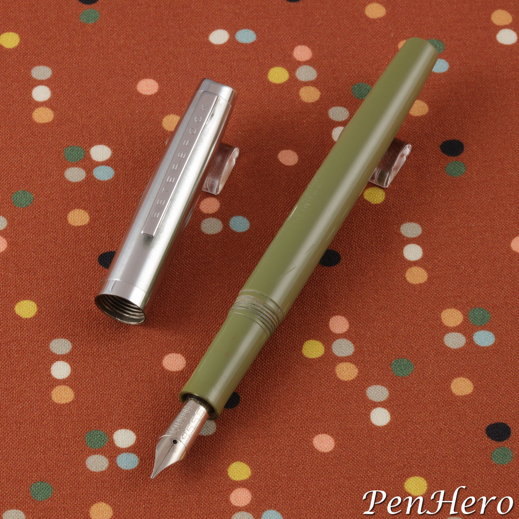
Esterbrook’s most popular and best-selling fountain pen has to be the J series. They remain popular today and are the focus of many pen collectors. Less well known are the several Esterbrook models that follow the J series, including this one, the Classic M2, one of the few squeeze filler equipped Esterbrook pens. The 5 1/4 inch long Classic M2 was designed by Henry Dreyfuss, the gist of which appears to be the crease in the cap top, like the crease in a fedora. The cap is polished stainless steel and comes in two versions, one with a plain chrome plated clip and the company name stamped on the cap band and the other with ESTERBROOK stamped down the chrome plated clip and with a plain cap band. The best feature is the pen can use any of the 32 different screw in Esterbrook Re-New-Point nibs.Read the story about this interesting pen here!
Eagle Pencil Company Reversible Nickel Plated Penholder c. 1870s-early 1900s
This simple, plain Eagle Pencil Company reversible nickel plated penholder is similar to many other reversible pocket pen holders made in the late 1800s through the early 1900s. It's a 4 5/16 inch dip pen holder (capped) designed to house the nib unit safely in the barrel when not in use and reversed and inserted into the barrel when needed, making the pen holder convenient for pockets and purses. The barrel is stamped EAGLE PENCIL CO. NY. It appears in the Eagle Pencil Company c. 1900 catalog, but it's likely that these were made at least as early if not much earlier than 1887, when Eagle introduced the Arrow Pen-Holder, an improvement on this type.Read the story about this interesting pen here!
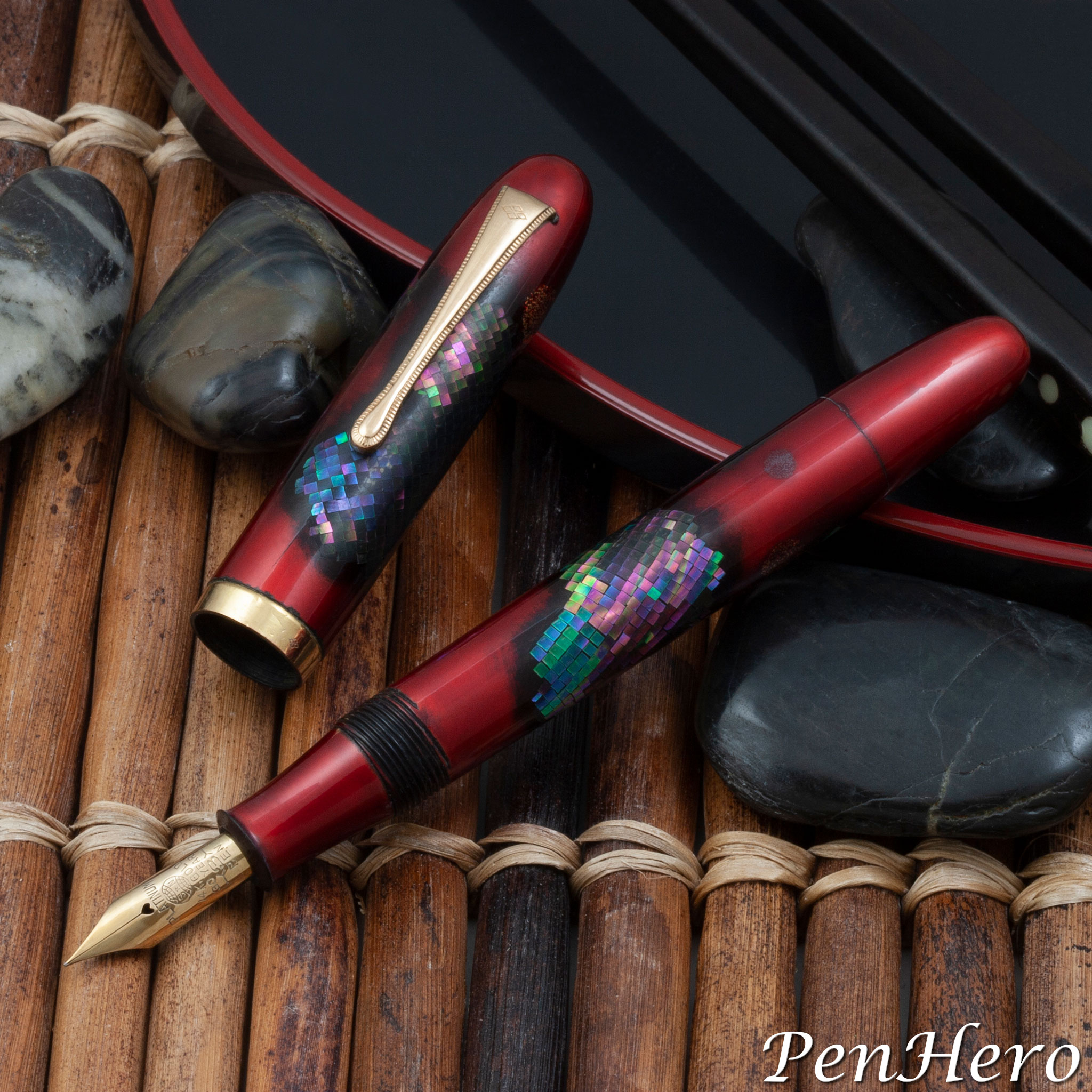
Yotubishi Raden Decorated Pen c. 1957
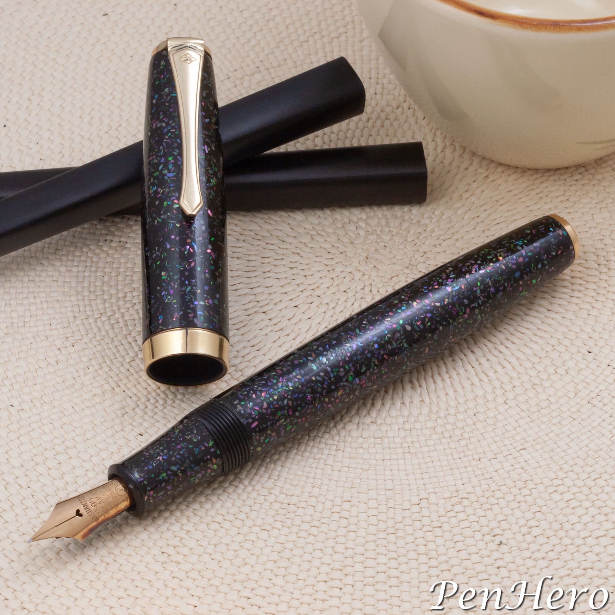
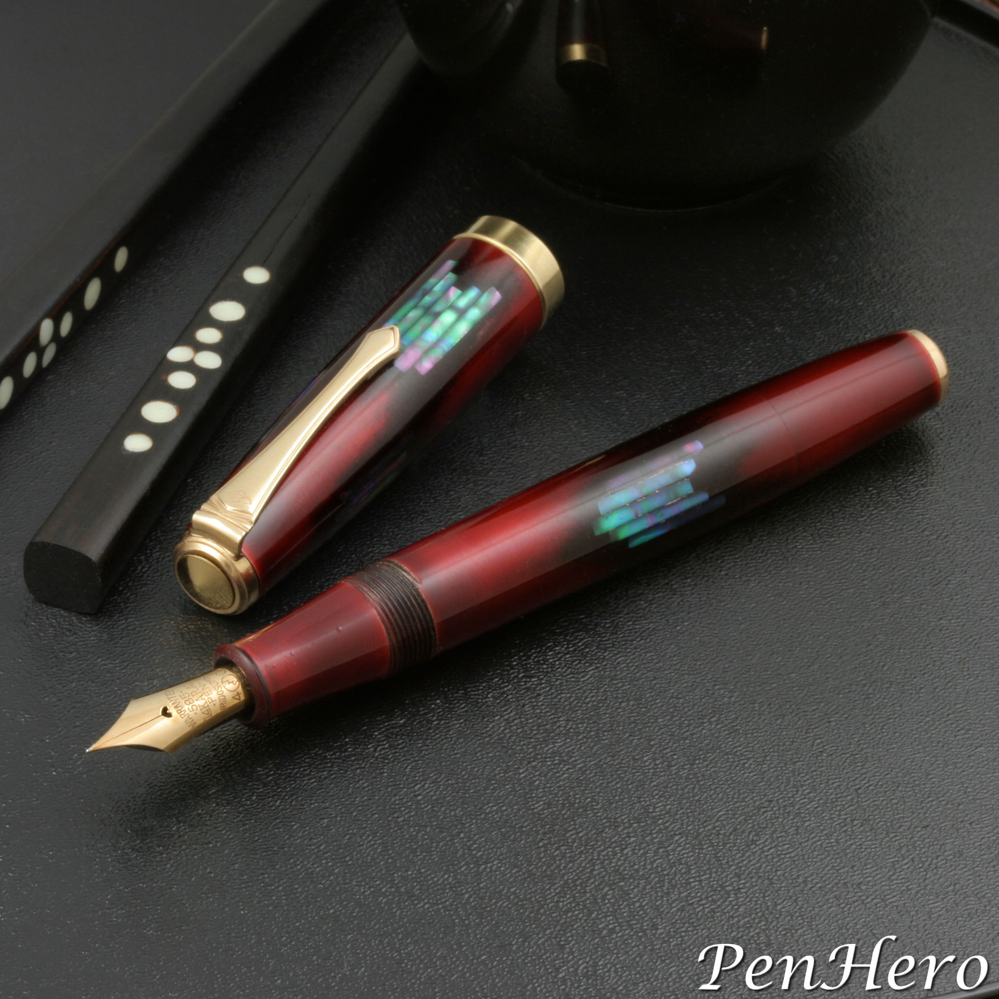
This c. 1957 Yotsubishi ink shut-off fountain pen is decorated using the Raden technique with a variety of colored, crushed abalone shell pieces including various shades of purple, pink, green and gold, inlaid into the surface of the dark urushi coated lacquer cap, barrel and nib section. The clip has the Yotsubishi four diamond logo stamped at the clip top. The cap band is rolled gold. The gold nib is stamped WARRANTED over 585 over 14KARAT over PEN over IRIDOSUMIN over the JIS mark flanked with 4 and 0. The JIS number cannot be seen but the stamping is identical to a nib on another Yotsubishi Raden decorated pen, so it may be marked 4622. A balance shaped Yotsubishi pen with the same Raden pearl chips inlay design is shown from a 1957 Ishi-Shoten catalog page in Fountain Pens of Japan on page 112. The caption says there were over twenty pearl inlay designs available in that catalog.Read the story about this interesting pen here!
Platinum Clear Fountain Pen c. 1952-1955
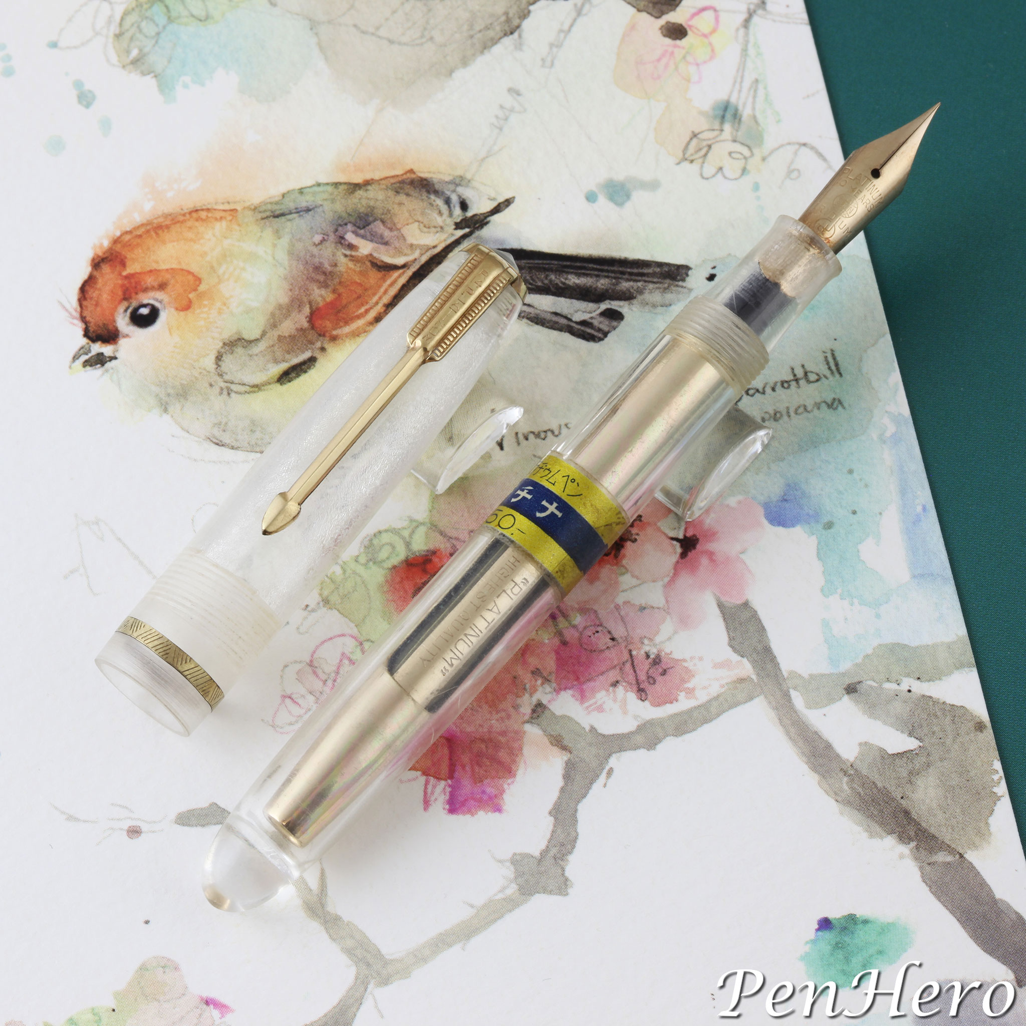
This c. 1952-1955 Platinum squeeze filler fountain pen has a clear plastic cap and barrel and a price band, indicating it was a production pen, not a sales demonstrator. The paper band shows a price of 550 yen, about $5.00 in today’s dollars. It reads "Gold plated Platinum pen" over "Platinum" over ¥550. This 4 7/8 inch long model would date from at least 1951 when nibs were marked with the Japanese Industrial Standards mark. The clip is stamped R14 at the top, indicating 14 karat rolled gold, above the name PLATINUM. The gold plated steel nib is stamped PLATINUM over 10 YEAR over IRIDIUM over the JIS symbol. The JIS number is unreadable in the section. This arrow clip style, with PLATINUM stamped down the top, is seen on pens dated as early as 1950. The cap and nib section are showing a lot of crazing, unfortunately.Read the story about this interesting pen here!
Yotubishi Kawari-nuri Sakura (Cherry) Bark Pattern c. 1955-1959
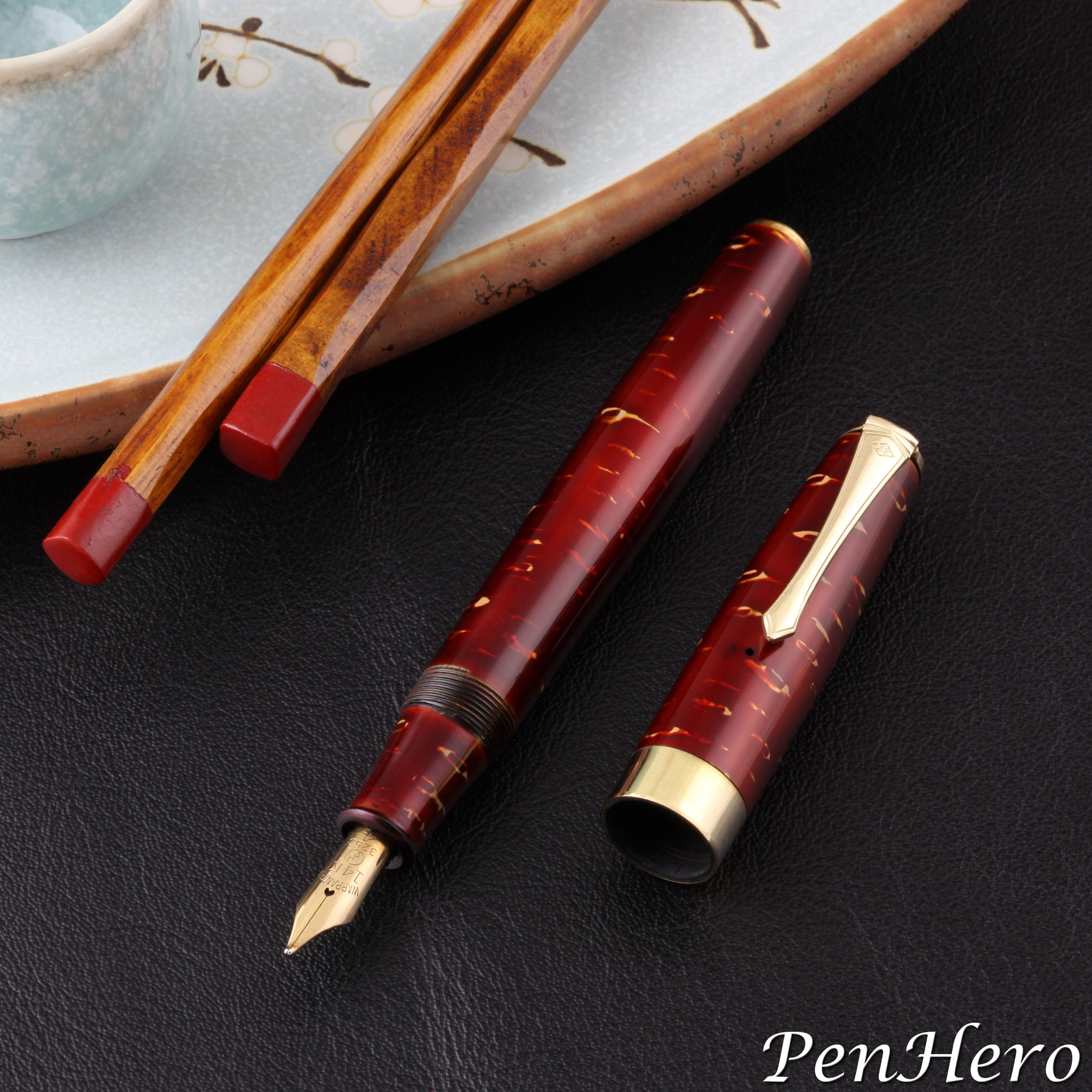
This is a c. 1955-1959 Yotsubishi fountain pen decorated with a Kawari-nuri technique sakura (cherry) bark pattern. The free form artwork recreates the pattern using contrasting yellow/gold elements in the red urushi lacquer base. It’s 5 1/4 inches long with gold filled trim and uses a squeeze type filler, possibly aerometric (which would require a feed tube), that dates the pen to the 1950s, following the lead of the filler design in the Parker 51 Aerometric. The gold nib is stamped WARRANTED over 14K over the JIS mark over 3253 over 4.Read the story about this interesting pen here!
Criterion Fountain Pen c. 1923-1926
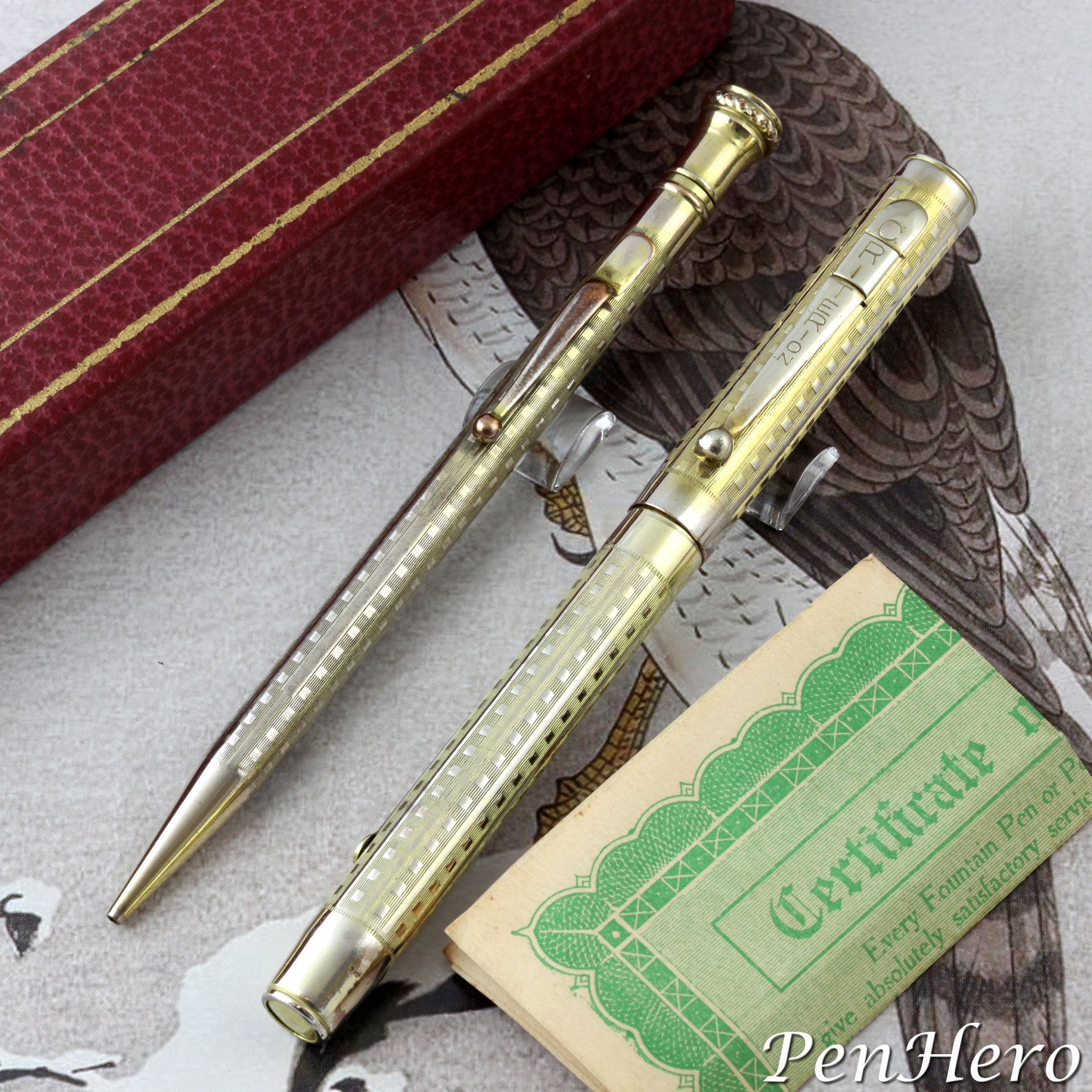
This is a Criterion machine engraved gold plated lever fill pen and pencil set c. 1923-1926. The engraving pattern is repeating panels of lines and boxes running the length of the cap and barrel. The clip on the pen is an interesting design where the clip appears to have three parts: The flat, ball ended clip, the part that crimps onto the cap, and a wide band that appears to hold the two pieces together. The clip face and the band are stamped CRITERION down the face. The lever is cleverly stamped FILLER, in case the user just might be confused as to what it's for, making those the only two markings on either writing instrument. The nib is stamped WARRANTED over 14K, a nice gold nib on an obviously inexpensively made pen. It’s about 5 1/8" long capped, and the pencil is almost the same length.Read the story about these interesting pens here!
Yotubishi Raden Tanzaku Decorated Pen c. 1957
This is a c. 1957 Yotsubishi ink shut-off eyedropper fountain pen decorated using a tanzaku style Raden mother-of-pearl shell inlay technique on red urushi lacquer done in two panels, one on the cap and one on the barrel. The pen was featured in the winter 2006 Pennant article “Collecting Japanese Pens” by Stan Klemanowicz. It was made by Ishi-Shoten Yotsubishi (literally yotu = four, bisi = diamond), a company from Osaka that made highly collectible decorated pens, but according to the article, sourced nibs and hardware from other pen companies. The four diamond logo can be seen at the top of the clip. The nib on this example is stamped WARRANTED over 585 over 14 KARAT over PEN over IRIDOSUMIN over the JIS mark flanked by 4 and 0.Read the story about this interesting pen here!
A Parker 51 Fantasy Trip - Part 2:Sergio Kullock Engraved Sterling Silver c. 1990s
When I pulled this pen out of the box, I was immediately struck by the cool touch of the sterling silver, combined with the sharp edges of the deep engraving. The piece is heavy and cool, like a Flighter, and warms up in the hand the same way, but no Flighter has the feel of this pen! This piece was made by Sergio Kullock, and is hallmarked "STERLING SILVER" and "SK" on the back of the cap. The Parker name is engraved on the cap front, as on the Parker 51 Aero-metric Signet all gold-filled pen. I've seen three examples of this engraved sterling silver pen, one of which had a chrome plated clip.Read the story about this interesting pen here!
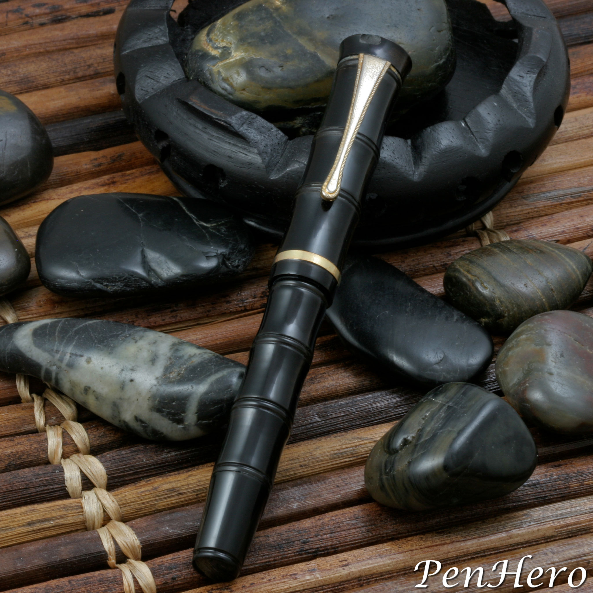
Yotubishi (Attributed) Bamboo Look Pen c. 1955-57
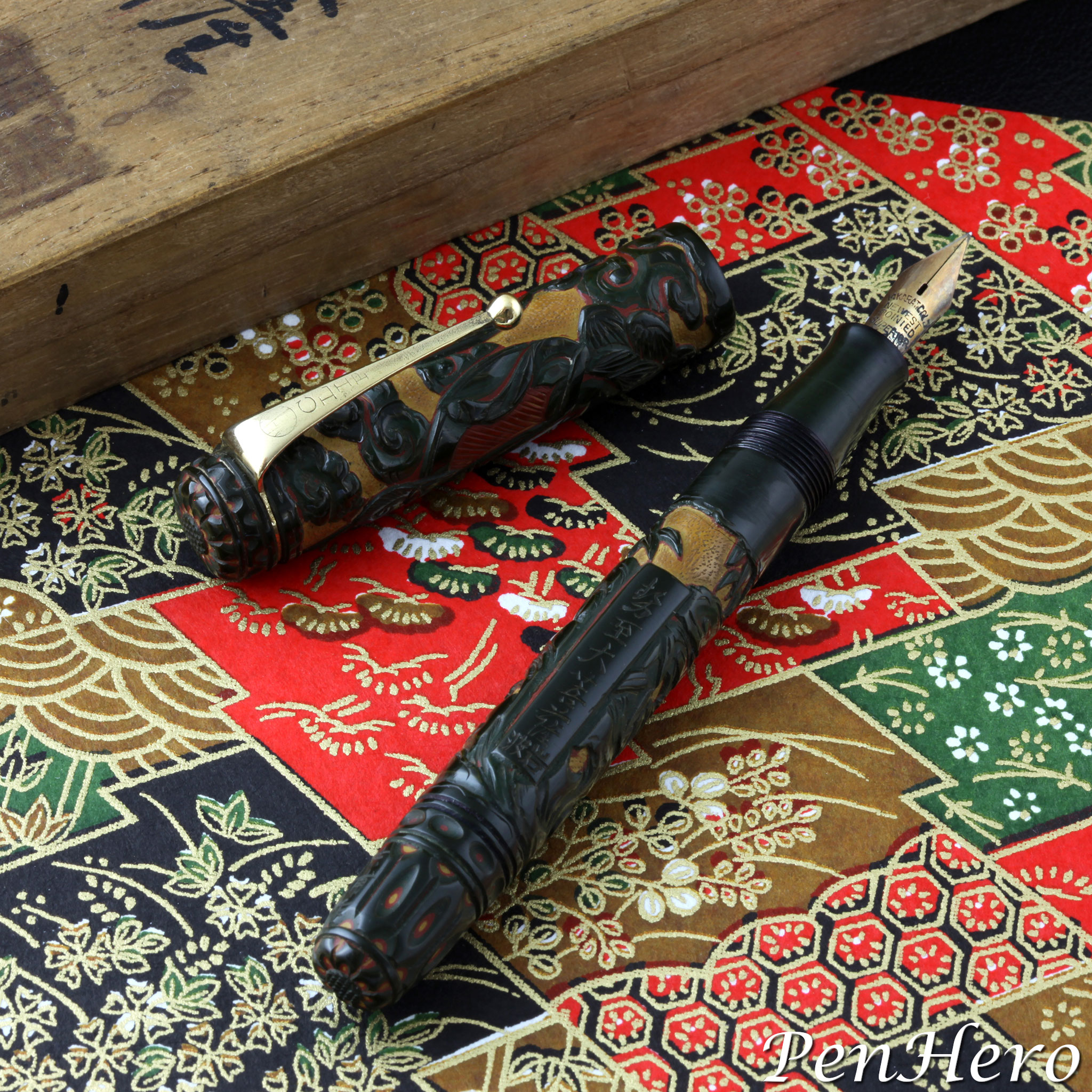
This is a Yotubishi black hard rubber fountain pen with a design carved and then lacquered resembling a shakuhachi 尺八 (Japanese bamboo flute), c. 1955-1957. The Ishi-Shoten Yotsubishi pen company consistently marked their pens on the clip top or cap band with the company’s four diamond logo. In some cases, the clip may be stamped YOTUBISI. Those maker's marks are absent from this example. A visually identical pen is shown on a page from the 1957 Ishi-Shoten Catalog, appearing on page 113 of Fountain Pens of Japan. The caption says “Chikoku (bamboo look), lacquered hard rubber,” though a literal meaning for chikoku 遅刻 may be slow carving.Read the story about this interesting pen here!
Yotubishi Shibayama Style Raden Decorated Pen c. 1957
This is a c. 1957 Yotsubishi ink shut-off eyedropper fountain pen decorated using a Shibayama style Raden mother-of-pearl shell inlay technique on red urushi lacquer. The pen was featured in the winter 2006 Pennant article “Collecting Japanese Pens” by Stan Klemanowicz. The pen was made by Ishi-Shoten Yotsubishi (literally yotu = four, bisi = diamond), a company from Osaka that made highly collectible decorated pens, but according to the article, sourced nibs and hardware from other pen companies. The four diamond logo can be seen on the top of the clip and on the cap band. The nib on this example is made by Platinum and is stamped PLATINUM over 14K. GOLD over 30 YEAR over 3 over PEN. The nib is likely a replacement.Read the story about this interesting pen here!
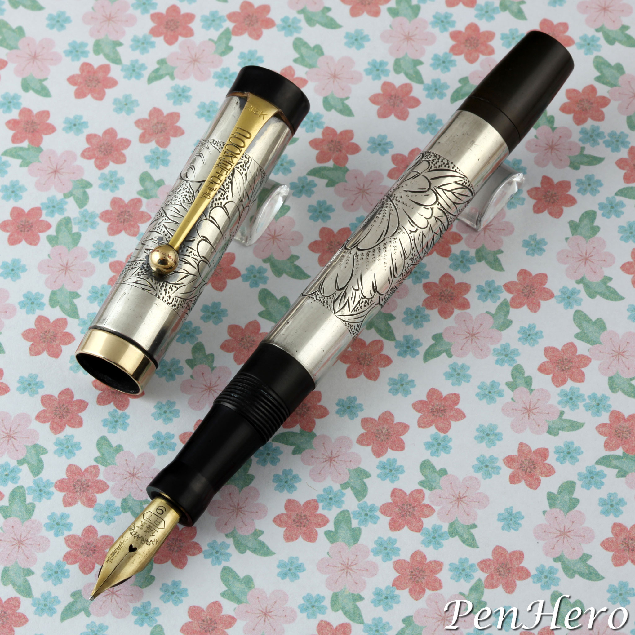
An Unbranded Peony Engraved Silver Pen c. 1923-1929
This is a c. 1923-1929 silver eyedropper fountain pen with hand engraved double peony (botan 牡丹) panels. The base of the cap and the barrel are both marked SILVER. The look of the pen is obviously inspired by the Parker Jack Knife Safety with the same basic cap and barrel shape, similar washer clip, and similar hard rubber cap top and barrel end. The clip is stamped POCKET CLIP on the face and 18K for 18 karat gold plate at the top. The cap band is stamped K14 for 14 karat gold plate. The gold nib is stamped WARRANTED over 14K over RT in a hexagon over 9. It’s 5 1/16 inches long capped. It's an eyedropper filler with an ink shut off valve. The hard rubber barrel end cap is stamped with three patent numbers, 64039, 67423, and 126473.Read the story about this interesting pen here!
An Unbranded Peony Engraved Silver Pen c. 1915
This is a c. 1915 sterling silver covered hard rubber eyedropper fountain pen with a hand engraved peony (botan 牡丹) design. The base of the cap and the barrel are hallmarked SILVER. The clip is a slip over type made of 18 karat rolled gold plate, marked RK18. The clip is similar to a Waterman design, and may be copied from it. The nib is a 14 karat gold semi flex stamped WARRANTED over 14K over GOLD PEN over IRI. NIBS. The nib stamping is typical of early Japanese gold nibs, dating it earlier than 1937. It may be the original nib, though nibs could be changed on pens over their life. The pen is a standard eyedropper type that is filled by removing the nib section and dripping ink into the barrel. It’s 5 5/8 inches long capped.Read the story about this interesting pen here!
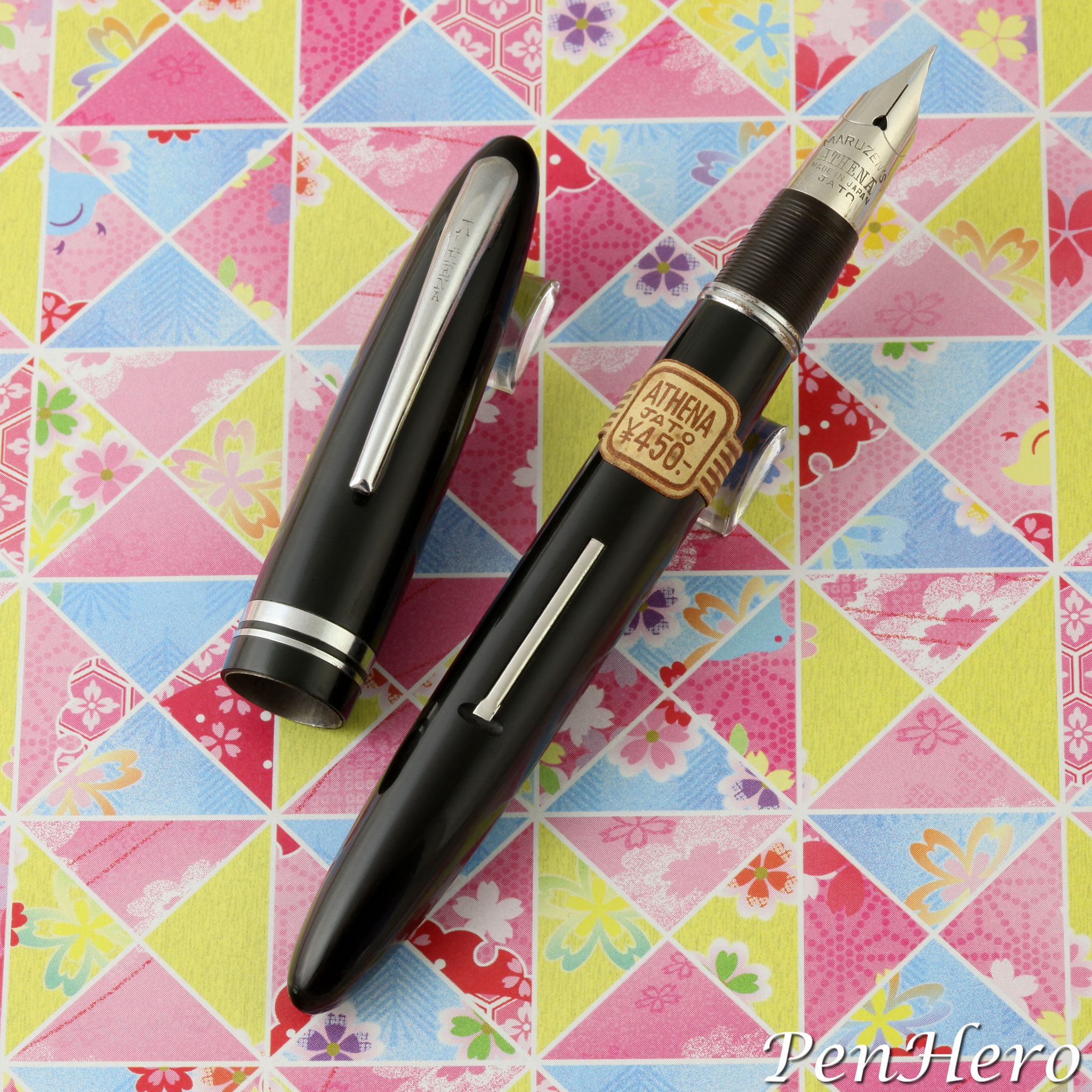
Maruzen Athena Pens with Sheaffer Triumph Style Nibs c. 1950-1952
These Maruzen pens were the first Japanese pens I have seen with a direct copy of a Sheaffer Triumph nib, but they were not alone. There are Navy brand and several unbranded pens with similar conical nibs. These post World War II Athena pens are examples of Maruzen’s return to making quality pens. One line is clearly inspired by mid 1940s Sheaffer Triumph fountain pens to the degree that they have a similar conical nib, ribbed nib section, and balance shape. They look like Japanese Sheaffer pens in the same way that many other companies copied Parker 51s. The second Athena line has a cap and barrel shape and style more like the 1940s Parker Duofold, though without the striped plastic. Removing the cap reveals the same Sheaffer Triumph style nib and section as on the balance shape pens.Read the story about these interesting pens here!
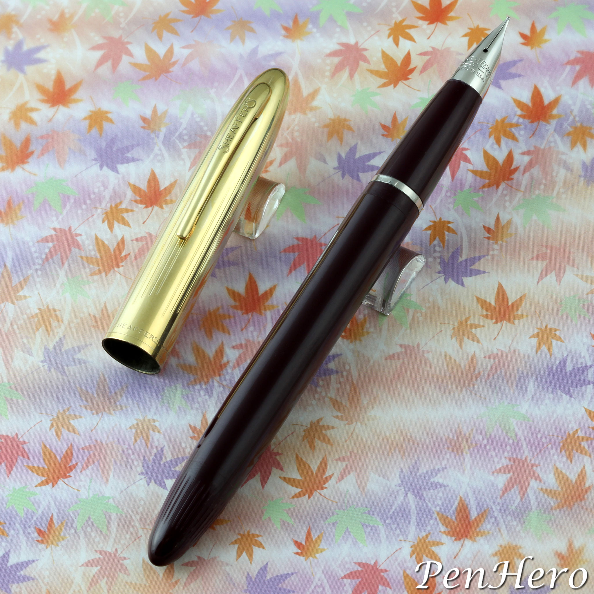
Sheaffer Gold Imperial, Model AS9G c. 1958-59
No sooner was the original 2015 article on the all plastic cap and barrel Sheaffer Imperial model AS9 finished when more information became available on this very similar Sheaffer pen. At first, it looks like Sheaffer took the Imperial AS9 and stuck a gold filled cap on it. Taking the cap off reveals it’s a pull off type, not a threaded type as on the Imperial AS9. And then there is the palladium silver nib. Shouldn't it be a gold nib like on the Imperial AS9? Is this a Touchdown Skripsert? Another sleuthing adventure awaits!Read the story about these interesting pens here!
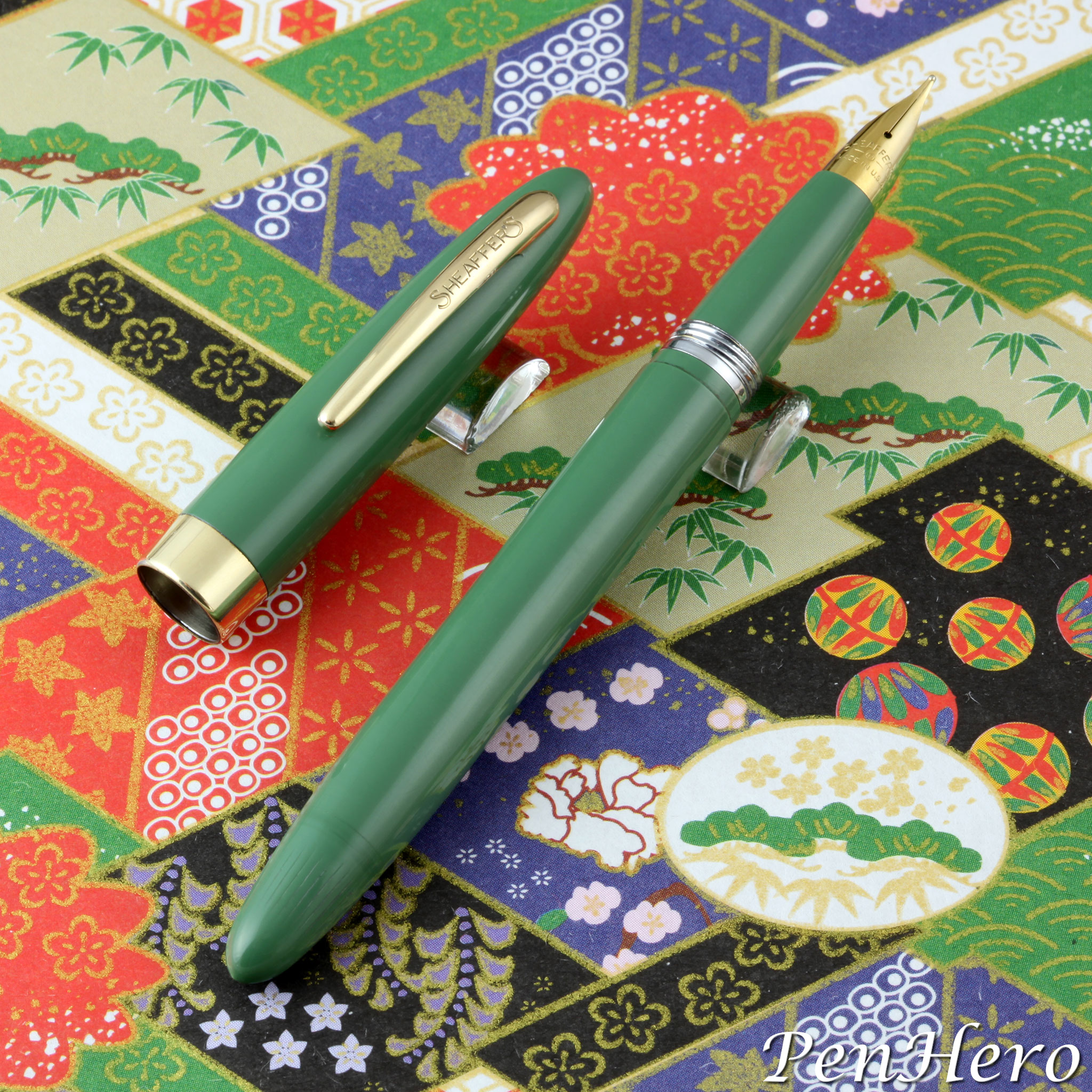
Sheaffer Imperial, Model AS9 c. 1959-60
This is a mystery pen. If this is an Imperial, why is it nothing like the later Imperials that look like junior size PFMs? We need to work backwards from the introduction of the Imperial IV, the first Imperial that used an Inlaid nib, first mentioned in the January, 1961 Sheaffer's Review. There is limited original documentation on this early and mostly overlooked Imperial, but enough to identify and date it. The primary sources are a Sheaffer England Retail Price List dated April 7, 1959, undated catalog pages from 1959 or 1960, and the Sheaffer Repair Manual model description page.Read the story about these interesting pens here!
Classic Pens LB5 Madreperlato Prototypes c. 2012
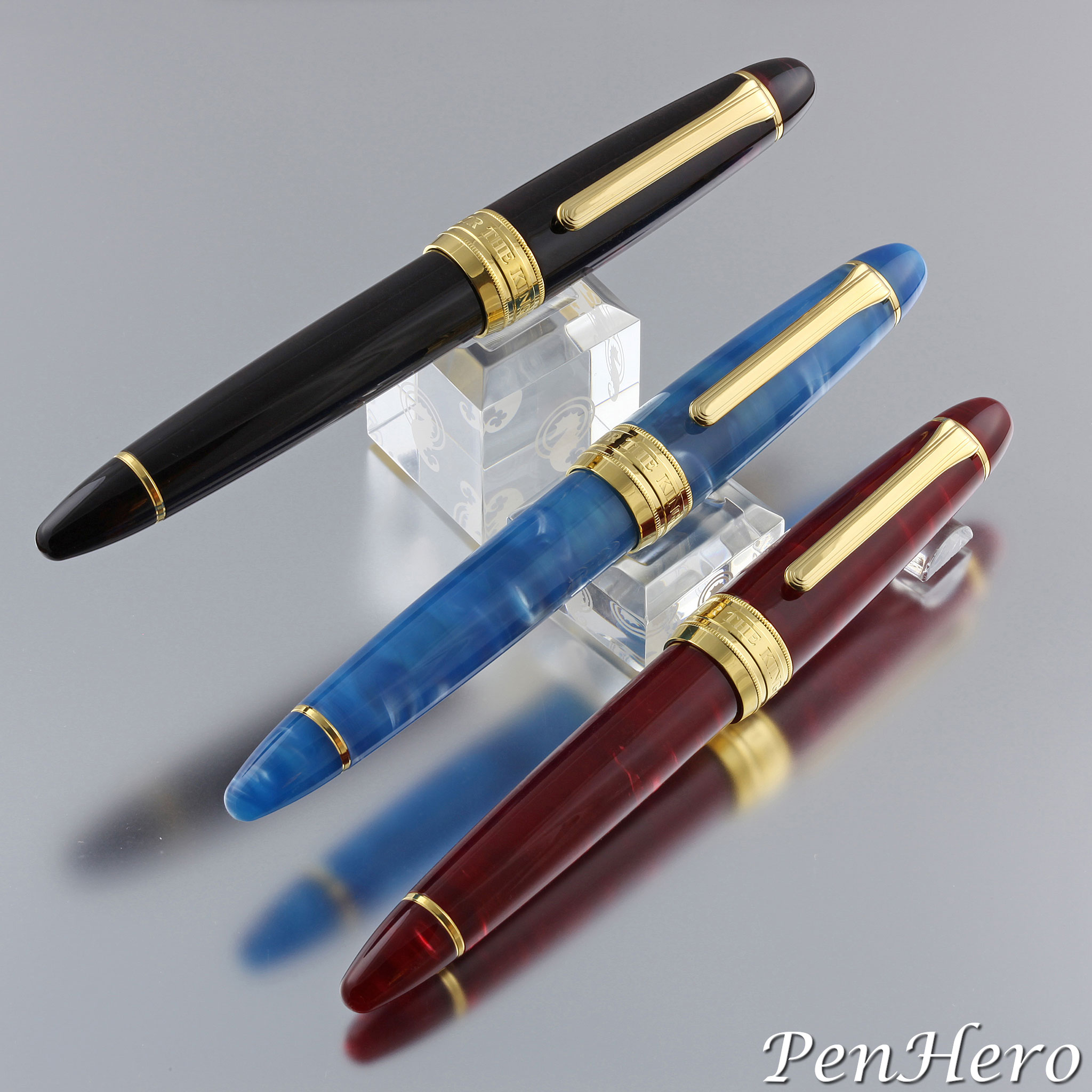
These are three of six Classic Pens LB5 Madreperlato prototypes, based on the Sailor King of Pen (or King Profit), made to test colors for the final production pens. During the prototyping process several customization decisions were made, including an increase in the overall length of the pen and choice of cap band and its decoration. The most visible customization would be the choice of material and colors for the cap and barrel. The color choice prototyping reveals some of the many decisions in how these pens came to be.Read the story about these interesting pens here!
Classic Pens LS Samurai Prototype c. 2001-2005
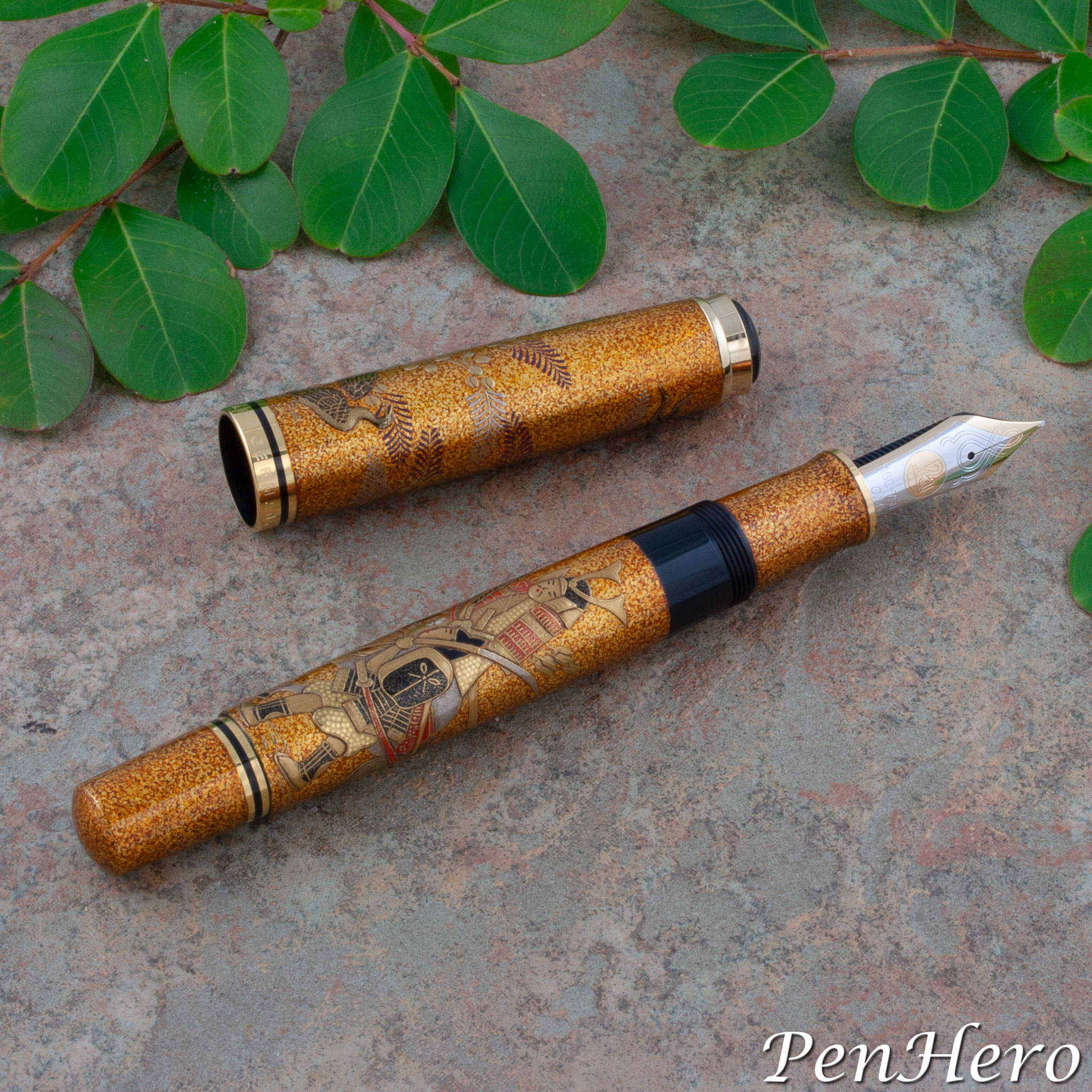
This is a Classic Pens LS series prototype with a samurai design c. 2001-2005. The Lambrou Sunami LS Collection was launched in 2001 as artwork done on Parker Duofold Centennial pens and each was a very small edition of about 15 pens in successive designs. The first pen was the LS1 Kirara (geometric) in 2001. That design comprises more than 1,000 individual strips of blue pearl and pure gold by Maki-E master Tatsuya Tōdō. The final pen in the series was the LS12 Shimarisu (chipmunks), released in 2004 with artwork by Maki-E master Shogetsu Mitani. The samurai design shown here is on a Pelikan fountain pen, a prototype for a proposed series of 15 pens. This design was also prototyped on the Parker Duofold Centennial.Read the story about this interesting pen here!
Classic Pens LR Collection 2001
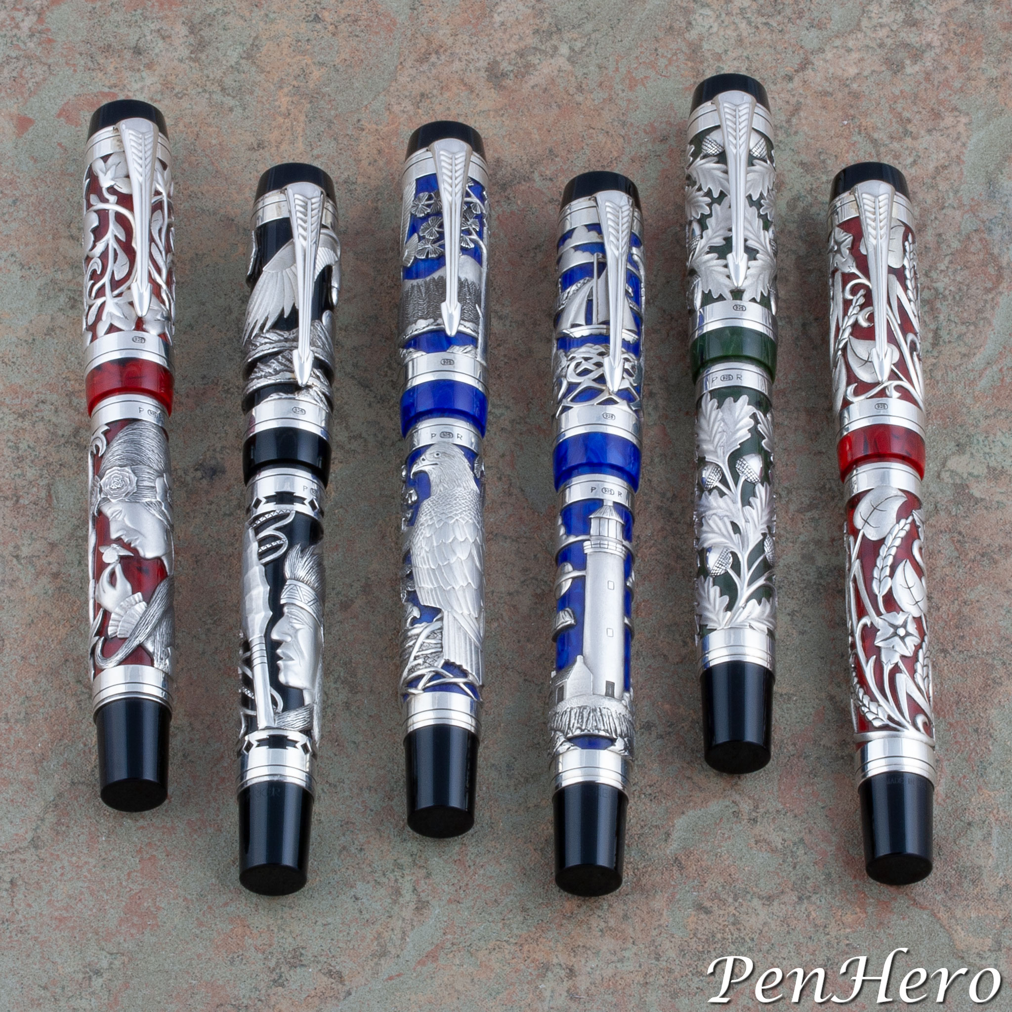
The Classic Pens Lambrou Rossi LR collection was a collaboration between Andreas Lambrou and Paul Rossi to make a limited number of sets of five sterling silver overlay art pens. Lambrou and Rossi first met at the Los Angeles Pen Show in 1991. The relationship began with trading vintage pens with Lambrou discovering Rossi's skill for pen design and silver craft. When Lambrou moved to Los Angeles, California in 2000 he began his long time working relationship with Rossi to create art pens. It is very rare to see all of these pens in one place and it was a special opportunity to photograph them individually and as a set.Read the story about this interesting pen collection here!
Classic Pens LR Lighthouse 2001
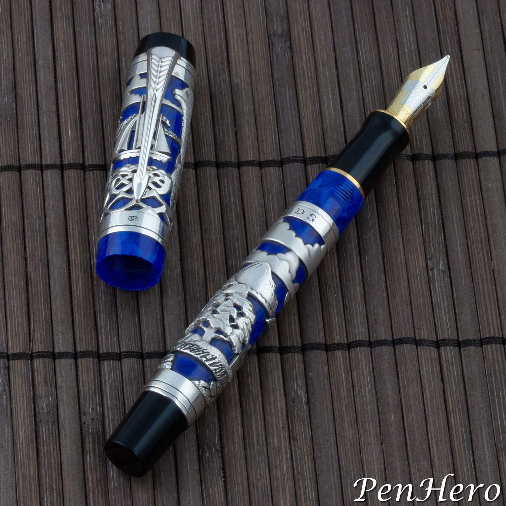
The Classic Pens LR Lighthouse is a one of a kind art pen following on the visual design of the LR series collaboration between Paul Rossi and Andreas Lambrou. It was custom made to be a gift, and the artwork on the pen is based on a stained glass panel. The design is comprised of two views of the lighthouse as separate scenes on the cap and barrel overlay panels.Read the story about this interesting pen here!
Classic Pens LR5 Alaska 2001
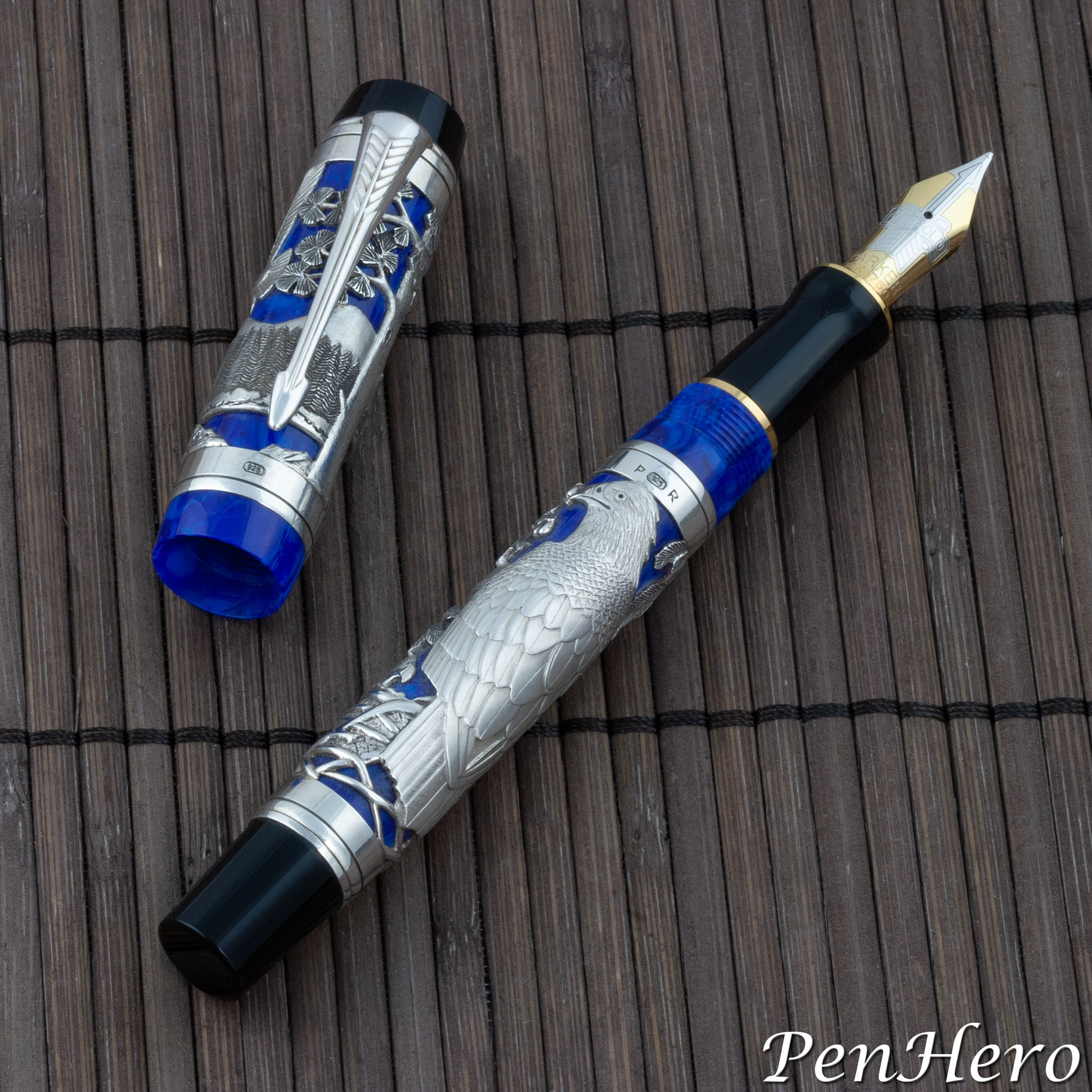
The Classic Pens LR5 Alaska fountain pen is the fifth and final pen in the LR series collaboration between Paul Rossi and Andreas Lambrou. The scene cut and carved into the sterling silver cap and barrel overlay by Paul Rossi depicts a family of eagles with the cap overlay scene showing the male soaring in flight over a blue lake and against a blue sky with a mountain range in the background. The foreground shows tall trees and rocky shores lining the lake, with one tree dominating the view. The female, with two sleepy eaglets is shown at the nest, in an overlay scene on the barrel. The artwork is cut in a way to use the Lapis Lazuli Blue of the Parker Duofold Centennial pen as colorful background.Read the story about this interesting pen here!
Classic Pens LR4 Muse 2001
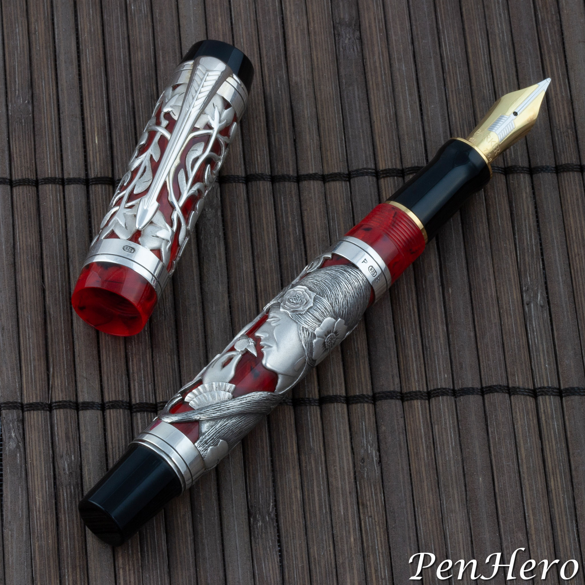
The Classic Pens LR4 Muse fountain pen is the fourth pen in the LR series collaboration between Paul Rossi and Andreas Lambrou. Andreas Lambrou described the cut and carved sterling silver artwork by Paul Rossi as inspired by the “muse of sculpture,” featuring the Muse’s head in profile with her long flowing flower adorned hair on the barrel panel. The cap panel features a lattice work of flowers with their stems and leaves. The overlays are on the Parker Duofold Centennial in Jasper Red, to highlight the artwork.Read the story about this interesting pen here!
Classic Pens LR3 Woodland Oak 2001
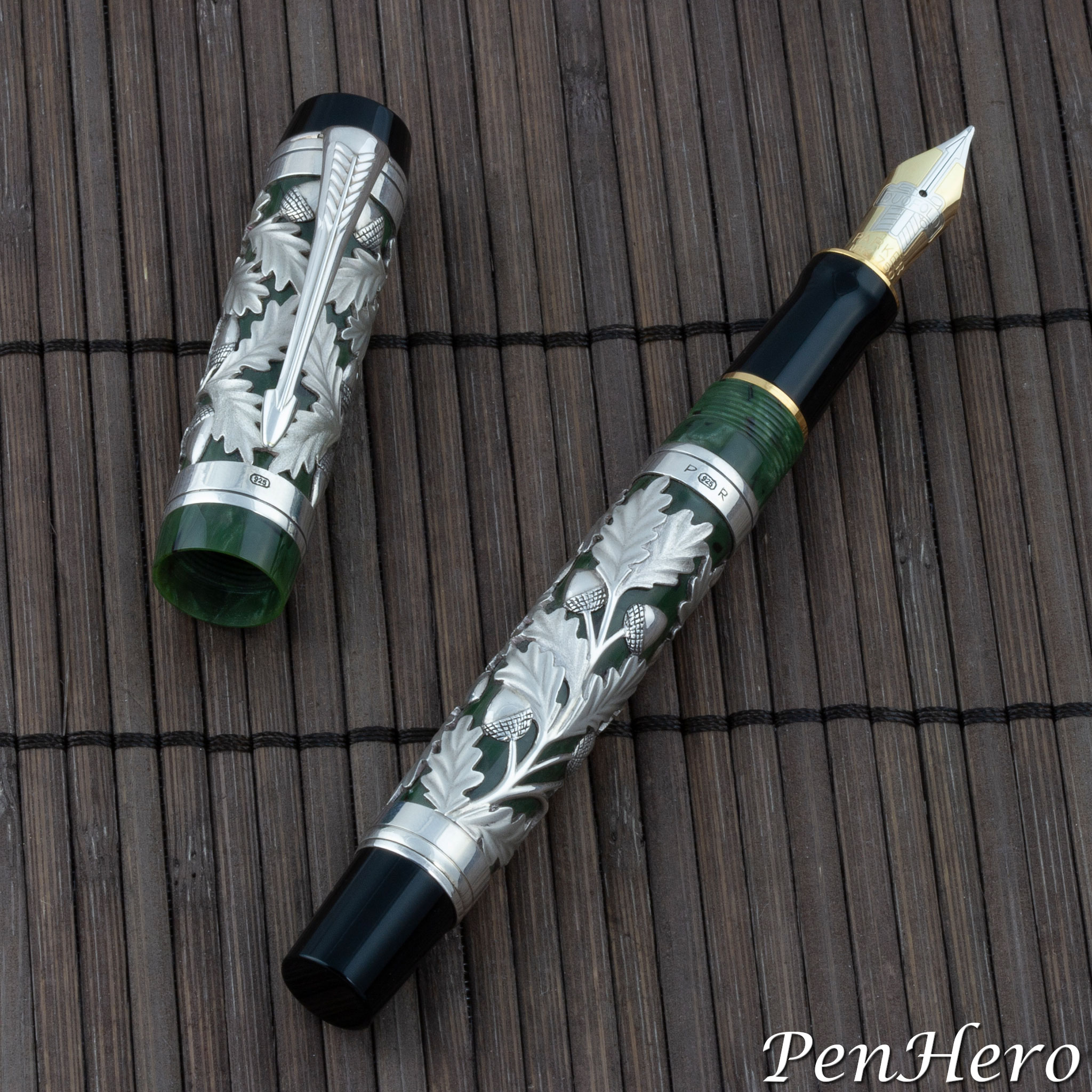
The Classic Pens LR3 Woodland Oak fountain pen is the third pen in the LR series collaboration between Paul Rossi and Andreas Lambrou. The cut and carved sterling silver artwork by Paul Rossi was inspired by the American oak tree, with a filigree of leaves and acorns in two panels, one on the cap and one on the barrel. The overlays are on the Parker Duofold Centennial in Jade Green, to compliment the natural forms.Read the story about this interesting pen here!
Classic Pens LR2 Harvest 2001
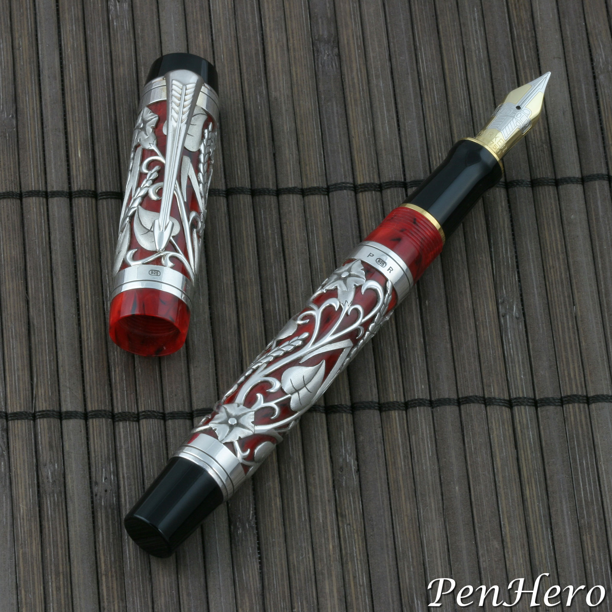
The second LR collaboration between Paul Rossi and Andreas Lambrou was the Classic Pens LR2 Harvest fountain pen, created by Rossi as a sterling silver overlay on the Jasper Red Parker Duofold Centennial. The overlay design is based on an original watercolor of golden wheat, grapevines, and morning glory flowers reminiscent of harvest time on the island Cyprus. Rossi’s design is an open, intertwining mesh of ripe seed heads of golden wheat and winding morning glory buds, leaves, and flowers leaving cutouts revealing the marbled Jasper Red acrylic of the cap and barrel as a background. Rossi evidently did not incorporate the grapevines and grapes from the original watercolor.Read the story about this interesting pen here!
Classic Pens LR1 Eagle Chief 2001
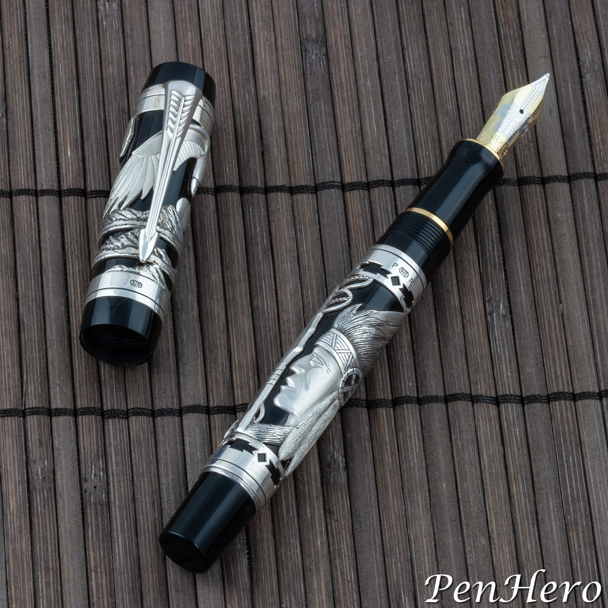
The first collaboration between Paul Rossi and Andreas Lambrou was a series of sterling silver filigree overlays on Parker Duofold Centennial fountain pens that became the Lambrou Rossi LR Collection. Development work on the LR pens started in 2000 and by the end of that year, Lambrou and Rossi decided on five designs. The collection, numbered LR1 to LR5, debuted at the February, 2001 Los Angeles Pen Show. The first pen in the new collection was the Classic Pens LR1 Eagle Chief fountain pen. The prototype design by Rossi was based on some of his earlier silver filigree work that portrayed a Native American warrior with a single feather headdress.Read the story about this interesting pen here!
Sheaffer Legacy Demonstrator Section c. 1995
Sheaffer often made demonstration models when the company introduced unique filling systems or nib units so that Sheaffer sales representatives and dealers could show how the new features worked. I could find no evidence that this clear section was ever produced to provide to Sheaffer dealers to demonstrate the new Legacy pens and therefore the few I have seen may have simply been model shop samples.Read the story about this interesting nib section here!
Parker True Blues: True Beauties 1928-1931
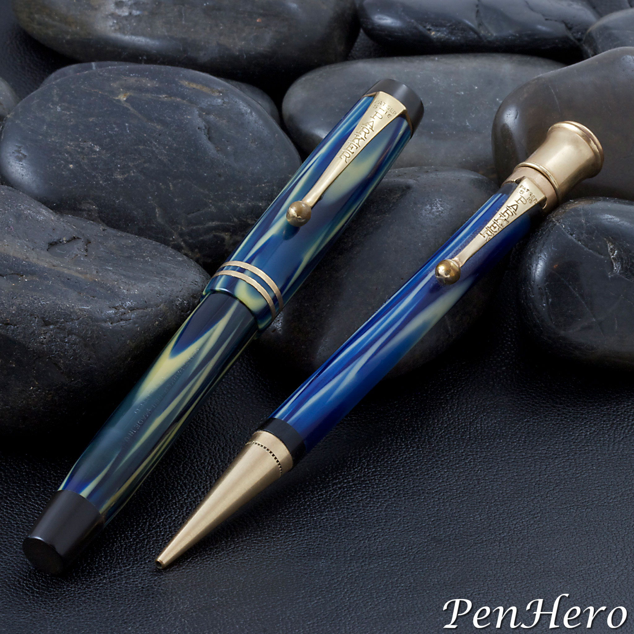
In 1928 Parker introduced one of the most sought after low-priced pens, known today by collectors as the "True Blue." This new slender blue and white swirled Permanite celluloid pen was called the "Three Fifty" in early Parker advertisements and the 1929 Parker catalog. The color was called "Modernistic Blue" in 1929 ads and the 1929 Parker Catalog and "True Blue" in 1930 ads and the 1930 Parker Catalog. The new "Three Fifty" was announced in a short article, "Parker Pen Fall Advertising Plans" in the September, 1928 Geyer's Stationer. The article indicates that the new pen line will be available in the fall of 1928. The earliest Parker advertisement I could find showing this new pen line is in the May 19, 1929 Pittsburgh Sun-Telegraph. The True Blue does not appear in the 1932 catalog, indicating that the line probably ran from 1928 through 1931.Read the story about this interesting pen here!
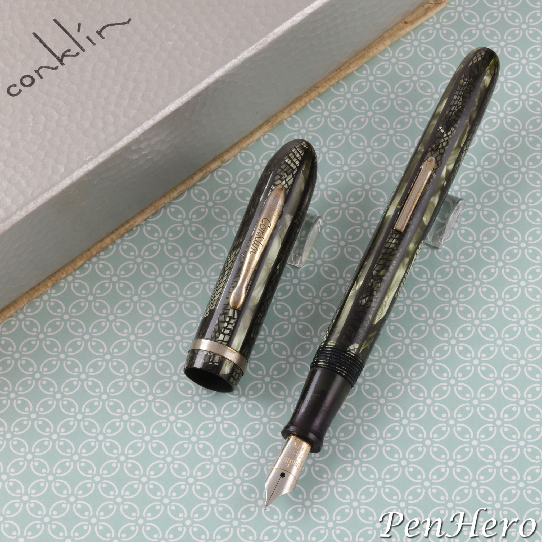
Another 1940s Conklin Glider-like Pen c. 1942-46
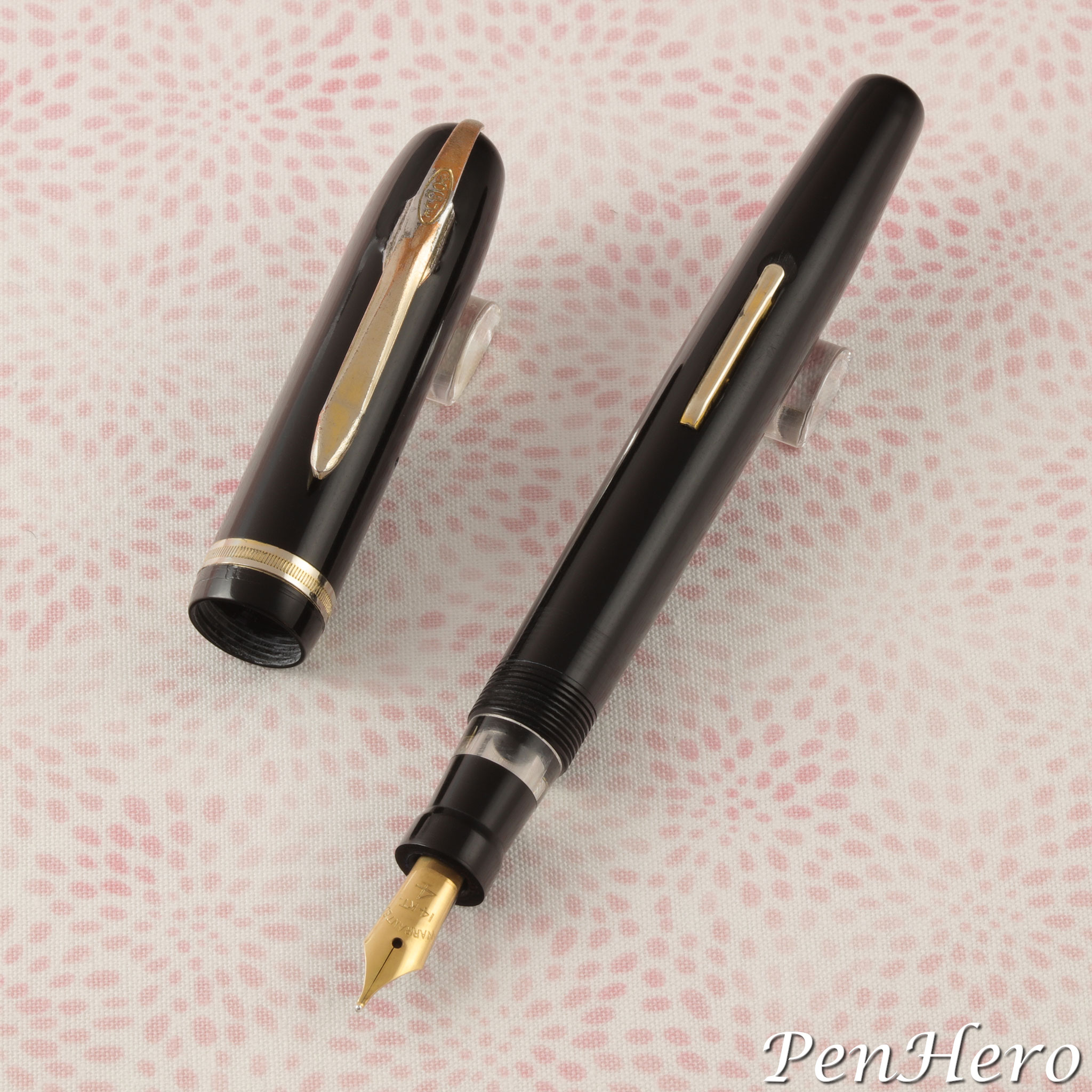
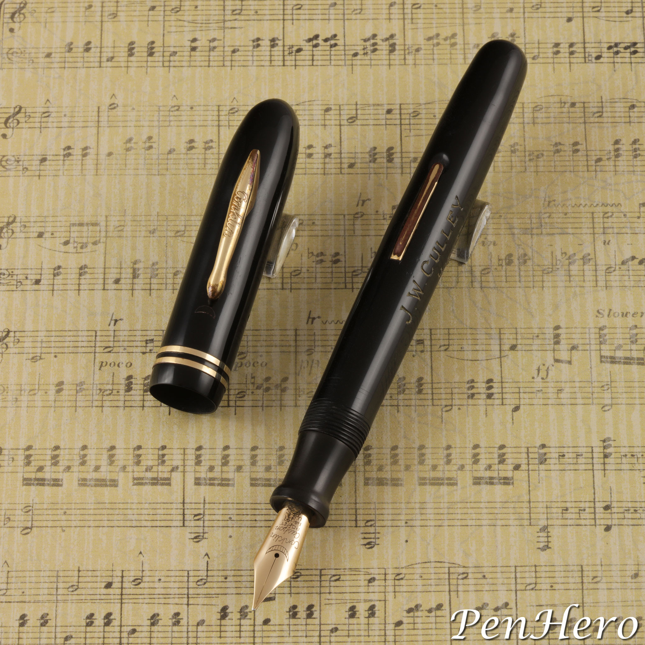
This recent pen show find looks a lot like the 1944-1946 Conklin Glider, with some very distinct differences. This 4 15/16 inch long Conklin pen is similar in shape and size to the slender size Glider and the cap and barrel can be swapped between the two pens. The cap and barrel ends are rounded rather than the more pointed ones on the Glider. And then the differences start to show.Read the story about this interesting pen here!
A Fountain Pen Depicting Seishi Bosatsu In Chôshitsu Style c. 1930
This is a Japanese ink shut off eyedropper filling fountain pen by an unknown pen maker from c. 1930 carved using the Chôshitsu technique. The inscription panel on the barrel reads Seishi Bosatsu, one of the two primary attendants to Amida Buddha. Seishi Bosatsu is the protector deity and provider of strength and wisdom for those who were born in 1930, the Year of the Horse. This symbolism, along with the Chôshitsu artwork dates the pen to or near 1930.Read the story about this interesting pen here!
Marukin Six Sided Eyedropper Fountain Pen c. 1920s
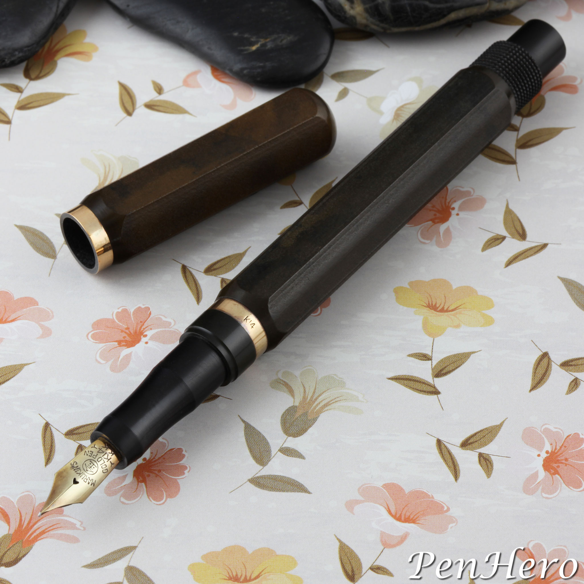
This unusual clipless six sided hard rubber Marukin eyedropper filler brings to mind eyedropper pens made in the United States and England from the early 1900s to 1920s. A review of very early Japanese eyedropper pens from the 1910s shows a variety of round cap and barrel pens with short friction fit caps that post onto a knobbed barrel end, a design evidently copied from early Onoto and Swan eyedropper pens imported to Japan. Many variations of the round barrel type can be seen in the catalogs of several Japanese pen makers into the very early 1920s.Read the story about this interesting pen here!
Marukin Two-Piece Cap Fountain Pen c. 1930s
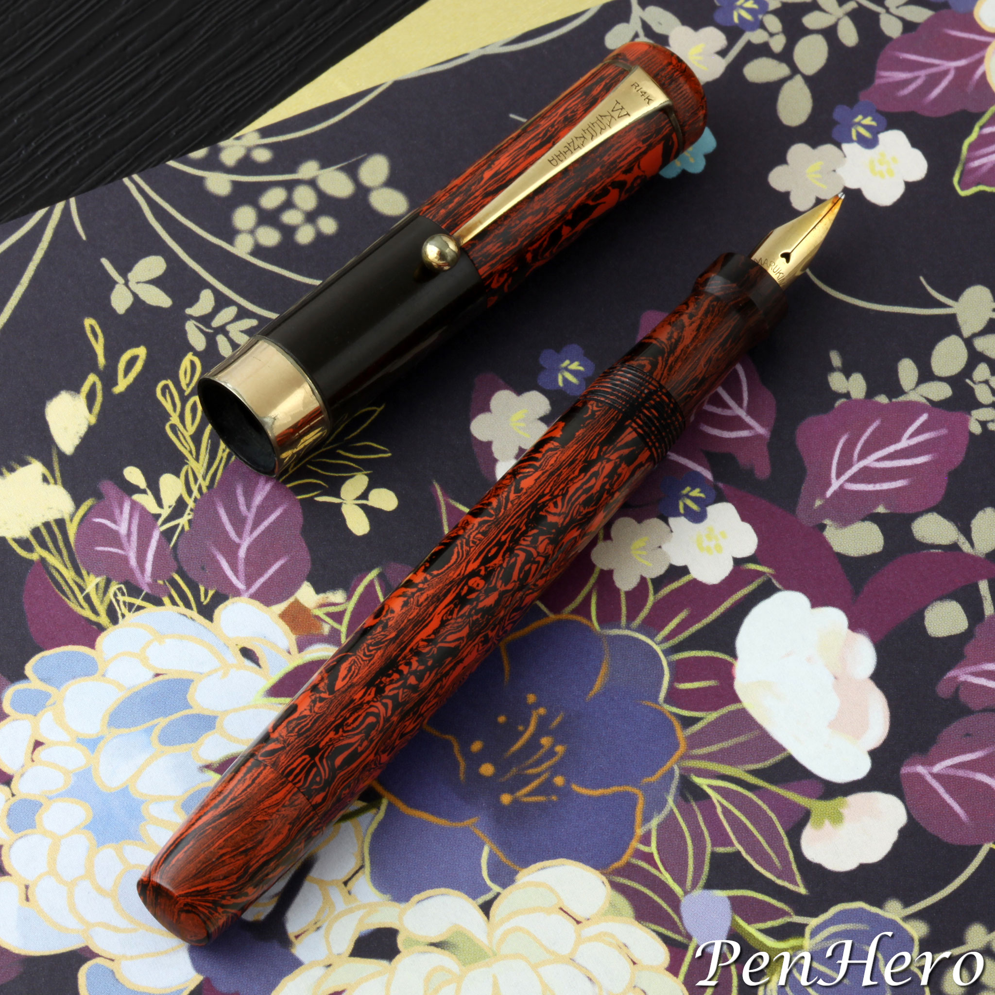
This is a Marukin mottled red hard rubber eyedropper pen with a shut off valve made in the 1930s. It operates as many other Japanese eyedropper pens by removing the nib section, filling the barrel with ink, putting the section back on, and then slightly opening the end cap to allow ink flow to the nib in order to write. What makes this pen stand out is the very unusual two piece cap. The cap can be removed as a single two piece unit as would normally be expected. The user could also separately unscrew and remove only the top mottled red hard rubber section of the cap, with the WARRANTED stamped clip, so the pen could be held using the black ebonite part of the cap as a wide grip. It’s not clear that this was the intended purpose of the two piece cap, but the black hard rubber bottom section can function in that way if a wide grip is desired by the user.Read the story about this interesting pen here!
Conklin Chicago Enduras c. 1939-1941
At first glance the two Conklin pens in this article could be Endura Symetrik pens from 1930s. They have all the elements shown in the A. Bienenstein Symetrik design patent, D83,592, awarded March 10, 1931: a rounded balance shape, a spring loaded clip, two cap bands, a crescent symbol on the cap, and a crescent symbol on the nib. The clip, the 1936 Conklin patented type, and nib, a Cushon Point type, could date the pen possibly as early as 1936. The barrel imprint tells a different story. It’s stamped THE Conklin PEN CO. over CHICAGO, ILL. U.S.A. over ENDURA – D- 83592 over REG. U.S. PAT. OFF. This is a Chicago Conklin. A Chicago syndicate consisting of A. J. Parrson, M. H. Jacobs, and Max Horwitz purchased Conklin on July 13, 1938, and moved existing stock of unfinished pens and parts to Chicago. This dates it no earlier than mid 1938, and likely later as there would have to be some amount to transition time from Toledo to Chicago operations and production.Read the story about these interesting pens here!
The Other Conklin Gliders? c. 1944-1946
If you see and collect enough 1940s Conklin pens you will eventually run across a few that look just like Gliders but not made with striped celluloid. Examples of these Glider-like pens can be found in both the standard and slender Glider size and have the same or a very similar Conklin stamped crimp on clip, the same single 1/16 inch wide plain cap band, and the same type of lever. The caps of these pens will swap onto the barrels of same size striped Gliders. These pens also show the same poor fit and finish and the same lightly gold plated trim that easily wears off. Nibs are inconsistent and many have gold plated stainless steel nibs. This example has the same barrel imprint as the Glider, "THE Conklin PEN CO. over CHICAGO ILL. U.S.A. over REG.US.PAT.OFF". Are these pens Gliders? Find out more in the article!Read the story about these interesting pens here!
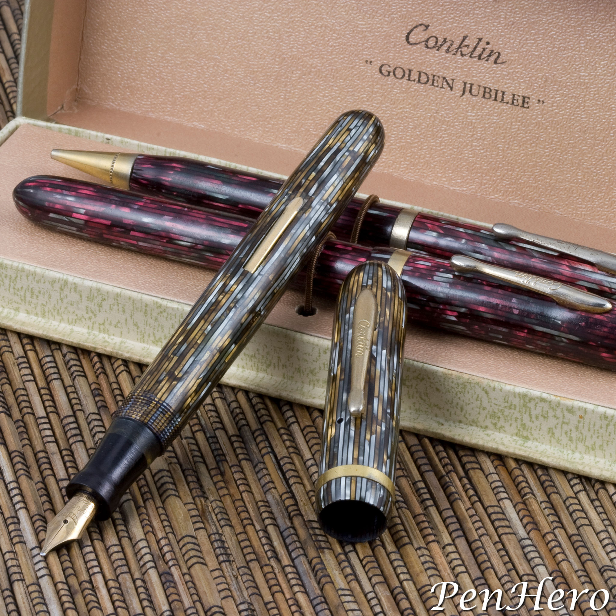
Conklin Glider 1944-1946
The Conklin Glider was the last quality pen made by the venerable company and describing it as a quality pen is something of a stretch. Roy Conklin and the Toledo, Ohio pen company that bore his name are probably most strongly associated with the first successful self-filling pen, the Conklin Crescent Filler. Conklin was established in 1898 by Roy Conklin and C. B. Gundy as the Self-Filling Fountain Pen Company in Toledo, Ohio and in 1901 the name was changed to Conklin Pen Manufacturing Company, the same year Roy Conklin’s crescent filler patent was awarded. Conklin crescent filler pens sold well, propelling the company into the majors of pen manufacturing. Gliders were cheaply made, compared to the earlier Conklin Toledo and pre-Glider Chicago pens, with lightly gold plated trim that wore off easily, cap bands that easily worked loose and poor fit and finish. The two best things about the pens were the 14 karat gold Cushon Point nibs and the interesting striped celluloid, described in Conklin advertisements as having "dichro-plastic striped inlay patterns.”Read the story about these interesting pens here!
Your on-line writing instrument magazine, featuring detailed reviews, history, news, shows, and product announcements, and more links to writing instrument focused sites than any other source.
PenHero.com Privacy Policy: The PenHero.com and PenBookmarks.com websites do not collect or store any personal data. We do not generate cookies. Never have and never will.
Contact us: Click here to send us an email!


